Thursday, January 31, 2019

Alex Barbier


Alex Barbier, photo by Renaud Monfourny.

Alex Barbier died last January 29. He's not in my canon, but maybe I owe him and his books a second look...

Tuesday, January 29, 2019

Sabrina by Nick Drnaso


Nick Drnaso, "Keith or Steve", Mome #22 (August, 2011).

Intro

So, I'm doing something I haven't done in a long while: to review some comics I've read recently.
Which ones, you ask... Well, as I said last October 25,  My Favorite Thing Is Monsters by Emil Ferris, Barcazza by  Francesco Cattani, Sabrina by Nick Drnaso, plus, Rey Carbón [king coal - a nice translanguage pun] by Francesc Capdevila (aka Max) and Berlin by Jason Lutes.

I can't write anything about the first two because a) My Favorite Thing Is Monsters hasn't reach the end yet (I never write about unfinished stories) and b) my Barcazza edition is in color (I didn't buy the first black & white version, yet...).

That said I'll add just this: I found My Favorite Thing Is Monsters a bit annoying (facile, I would say; plus: if she's not copying a photo Emil Ferris can't really draw - hands especially - hence the "this is just a little girl's sketchbook" trick); on the other hand Barcazza seemed an Antonioniesque exercise to me, with a weird unexplained (or is it unexplainable?) sequence... In four words: I wasn't particularly impressed. Even so, my taste leans more to the classicism of Barcazza than to the baroque atmosphere of My Favorite Thing Is Monsters. Mainly also because my favorite thing isn't monsters.

On the other hand, Sabrina, Rey Carbón and Berlin are another thing altogether... but Rey Carbón and Berlin will have to stay on hold, for now...

Sabrina by Nick Drnaso

The first time I read a Drnaso story was in Mome #22. As it happens frequently, if a story doesn't impress us enough, and the reasons vary, from distraction, to a lack of connection with the theme, or the art style, or the mood, etc... we forget all about it. This meant that, yes, I forgot all about Drnaso... To put it bluntly: it was all the hubbub around the Man Booker Prize that made me try a Drnaso story again.
  
According to Anita Singh, at The Telegraph 
The judges praised Drnaso's work as "oblique, subtle, minimal, unmanipulative" and said: "Given the changing shape of fiction it was only a matter of time before a graphic novel was included on the Man Booker longlist. Sabrina makes demands on the reader in precisely the way all good fiction does."
Basically this means that we can't trust comics crits. In which alternative world do comics critics (with their praise for direct, blunt, baroque, manichean stories) find value in obliqueness, subtlety, minimalism, nonmanipulability? If there's one, I want to be there and forget all about the San Diegos and Angoulêmes of this world...

In "Keith or Steve" Drnaso did a couple of things of note: 1) the words (a voiceover, if I may compare comics to film) don't match the images exactly; 2) in the page above he shows an unremarkable character (is he Keith or Steve?, he doesn't know) in the first two tiers and compares him with idealized advertising kitsch; not only that, but we also learn in the captions about a certain woman - whose name he can't remember either - who's in narcotics anonymous).

In Sabrina there are no captions. There are no thought bubbles either. What we see and read in the speech balloons is what we get. Which isn't much, apparently, but what do we see, exactly?


No, it isn't a Tintin or a "Bringing Up Father" comic... but, hey, the continuous equal width lines, the flat colors... yep!, it's a clear line for the 21th century.

1) The art style...

...is the clear line. No other drawing style used in comics, so far, conveys detachment better.


2) The colors:

Nick Drnaso used mostly muted colors. If we look at the "Keith or Steve" page above and notice the above mentioned contrast between a dull existence and an idealized life we can look at the colors in Sabrina in the same way. Only Cici's children's books, and not much else (the beach, and even then, the color shades are more pastel than garish; a shop window, ditto...) have bright colors... Plus: in the above page the layout is united in the first panel, and fragmented in the lower tiers. If we remember that religion means "reconnect," do I need to say more?...


3) The character's eyes:

To show us how alienated the characters are Nick Drnaso drew their eyes as two dots and not much else. The exceptions are few and far between, mostly in the virtual reality of the Internet (see above) or in the frontispiece illo in which Sabrina's portrait is more detailed. Another remarkable exception are Cici's eyes... children, again, are different...

4) Cats:

Aren't cats cool and detached?...

In Sabrina there's some sort of David Lynch effect which is described here by David Foster Wallace:
Lynchian refers to a particular kind of irony where the very macabre and the very mundane combine in such a way as to reveal the former’s containment within the latter.
In Sabrina the effect is lynchian, with a nuance. Maybe there's no irony, maybe there's just a matter of factness that's even more creepy and reminds us of Annah Arendt's banality of evil. More than that, maybe nothing threatens us and we just fear fear itself in a world of simulacra where reality melted down leaving us in a constant state of detachment and/or paranoia...


Nick Drnaso, Sabrina, May 2018. 

Friday, January 25, 2019

The Ridiculous City

Angoulême is seriously running the risk of becoming one of the most ridiculous cities on earth.

Wednesday, January 23, 2019

Monthly Stumblings #16: M. S. Bastian, Isabelle L.

Bastokalypse by M.S. Bastian and Isabelle L.

Is context everything? Maybe not, but it means a lot...

Simply put Bastokalypse is a book depicting genocide and war. So far so good (or not, of course... nothing is simple, as Sempé would put it...), the problem is that the authors, M. S. Bastian and Isabelle L., use the derisive ironic expression typical of comical comics as transformed by the Gary Panter, Mark Beyer ratty line aesthetic school (aka Art Brut).

What's the difference between Bastokalypse and Zbigniew Libera's Lego Concentration Camp art piece, then? (The comparison is not mine: being a orihon, concertina bound book - see below -, Bastokalypse has a long drawn strip on one side and an essay about the iconography of violence by Konrad Tobler on the other; Libera's toys are part of a long list of references summoned by Tobler; more about this later.)


Bastokalypse by M. S. Bastian and Isabelle L., Verlag Scheidegger & Spies, 2010.


 From left to right: Goch Museum director Stephan Mann, Isabelle L., M. S. Bastian, 2010 (Bastokalypse is on display in the background). (See also here.)


Zbigniew Libera's Correcting Device: Lego Concentration Camp (1996).

As a gallery comic Bastokalypse is a continuous sequence of black-and-white paintings: 32 canvases (3 ½ x 5 ½ feet each), forming a continuous 168 feet long drawn strip. The book has 32 action packed double-page spreads in baroque, claustrophobiac, horror vacui, nightmarish, compositions.

Numerous cultural references  collapse the difference between high and low: from Ronald McDonald to Pablo Picasso's Guernica, from Gary Panter's Valise to Jacques Callot's La Pendaison (The Hanging Tree) and Otto Dix's Der Krieg (The War)...


Pablo Picasso, Mark Beyer, Ghost Face, Jack...


Picasso again, José Guadalupe Posada, 9/11.

On the other hand, here's how Stephen C. Feinstein described Zbigniew Libera's Correcting Device: Lego Concentration Camp:
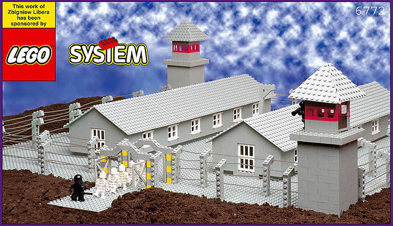
Each unit of the seven-box set contained a different aspect of a concentration camp. The larger boxes showed the entire concentration camp, with buildings, gallows (one showing an inmate being hanged), and inmates behind barbed wire or marching in line in and out of the camp. An entry gate similar to the stylized "Arbeit Macht Frei" entry point at Oswiecim is included, although without the German inscription. The guards, in black shiny uniforms, came from the regular LEGO police sets. The inmates came from LEGO medical or hospital sets. A second box showed a crematoria belching smoke from three chimneys, with sonnderkammando [sic] or other inmates carrying a corpse from the gassing room. The smaller boxes depict a guard bludgeoning an inmate, medical experiments, another hanging, and a commandant, reminiscent of something more from the Soviet Gulag than the Nazi concentration camp system, as he is bedecked with medals and wears a red hat. Some faces on both inmates and guards are slightly manipulated with paint, to make mouth expressions turn down into sadness for the inmates, and upwards in some form of glee for the guards. The last box is one full of possessions, the type of debris painted by other artists and inspired by the vast array of loots collected by the S.S. in the Kanada warehouses at Birkenau.
Libera calls his Pop cum Conceptual Art projects (i. e.: toys) "Correcting Devices" because he supposedly wants to correct the wrong info given to children about the world. José Cardoso did a brilliant analysis of this particular Libera work. He did it using as theoretical framework the visual rhetoric findings of the Belgian Mu group. He basically concludes that, with a few changes (the suppression of the vivid colors, typical of the Lego construction toys, for instance) Libera's Lego Concentration Camp functions in the interpenetration rhetorical mode: two distant spaces meet in a third space where both may co-exist at the same time. This third space is constructed by the viewers according to their interpretation. Said rhetorical mode is often used to provoke laughter, for instance, in Monty Python's famous Greek vs. German philosophers soccer match.

Interpenetration in Bastokalypse exists between all the aforementioned serious historical and cultural references and a tradition of comical caricature dating back to newspaper comics and animation during the first half of the 20th century. This tradition was revived and transformed during the second half of the same century by the underground and alternative movements.

The way in which we represent the Shoah has been a matter of debate for decades, of course. Libera's Correcting Device: Lego Concentration Camp was, as expected, polemical from the beginning. Stephen C. Feinstein:
During May 1997, Libera was invited to display his other pop art pieces in the Polish pavilion at the Venice Biennale, but was asked by Jan Stanislaw Wojciechowski, the curator, not to bring Lego. [...]  He wound up withdrawing from the exhibition.
I don't know the reasons why people found the Lego concentration camp offensive. Maybe they associate a toy with children's puerile pleasure trivializing (and, in a way, mocking) the Holocaust?

Anyway, nothing seems to shock people much these days. In more recent times a set was purchased by the Jewish Museum in New York and  the Museum of Modern Art in Warsaw acquired Libera's concentration camp from a Norwegian art collector for $71,800. The consensus seems to be that Libera's piece is a criticism of the manipulation of young people by educative systems. Also, the Lego connection is a criticism of corporate culture.

I'll bring to the table another decisive factor, in my humble opinion, of course: Libera's work is part of a high art tradition that legitimizes it and narrows the set of possible interpretations. In other words: it brings with it all the weight of what French sociologist Pierre Bourdieu called cultural capital.

Does Bastokalypse share the same privilege? The publishers and curators who support Isabelle L. and M. S. Bastian's work surely try: galleries in Switzerland (Labo and Papier Gras) specialized in the exhibition and support of the comics avant-garde and graphic art in general function like other more mainstream gallery venues. Konrad Tobler's essay tries to give the work a theoretical frame that includes it among many illustrious and not so illustrious (in a post-modern mish-mash) forefathers.

Do they succeed? I'm not so sure. I, for one, view Bastokalypse as an interesting and impressive effort (ten years in the making), but also as a message that's undermined by its own expression collapsing in the process. Is M. S. Bastian's and Isabelle L.'s irony completely intended? If not, they delude themselves, if it is I can't accept it. Call me square if you will or whatever, but I will say it just the same: in the name of the victims. Comparing Bastokalypse with Francisco de Goya's Los desastres de la guerra (The Disasters of War) or even with Jacques Tardi's C'était la guerre de tranchées (It Was the War of the Trenches) doesn't save it from being inconsistent (the comparison with Art Spiegelman's Maus is more apt though: both books come from the same place; the difference is that Maus' (in)expression is a lot more distanced). To end this post in a positive note: I don't exactly dislike the Posadesque, dance of death, carnivalesque, derisive feel of it all. In the end we're nothing: Bastokalypse blows up our feelings of self-importance. I may not exactly like it, but, with a few exceptions, that's what comics have done best for decades...


Adolph Hitler, Mark Beyer, a mutant Mickey Mouse, and one of Charles Burns' goons (M. S. Bastian and Isabelle L. avoided the controversial depiction of the Shoah).

Monday, January 21, 2019

Marlon Brando


June 12th 1973

Just change "Motion Picture Industry" for "The Comics Industry".

Tuesday, January 15, 2019

Monthly Stumblings #15: John Porcellino

“Christmas Eve” by John Porcellino in King-Cat Comics & Stories # 72

John Porcellino’s mini-comic series King-Cat Comics & Stories is approaching issue # 75. At the current pace it probably will reach that unusual landmark, in the world of zines, in time to celebrate 25 years of continuous publication.
When it started, in 1989, John Porcellino was an art student attending Northern Illinois University. He graduated, but, in his own words in an interview with Zak Sally (The Comics Journal # 241, February 2002, 49):
[…]making paintings involves a lot of stuff I don’t want to be involved with. In order to have that process, you’re dependent on all these other people and institutions[…]
To tell you the truth, I’ve been there too so, I empathize with someone who stopped painting. Like John Porcellino, though, I can’t fully understand why I stopped either. Here’s what he has to say in the next page of the aforementioned interview:
[…]I was a crazy painter, I loved painting. I loved art. And, at some point I just panicked or freaked out or something. I started tearing it all down instead of putting it together. I still wonder about what happened and what was I afraid of.
Artists with poor social skills tend to avoid competition. They may also view the art market as a morally corrupt place eager for them to sell-out. Anyway, what’s interesting is that the rarefied world of self-published comics was, for John Porcellino, an affirmation of integrity, a cry of freedom and a sign of a life style (an attitude), more than anything else: “Drawing your own comic and putting it together in this day and age really is a revolutionary act” (John P. dixit).
I can’t remember when my eyes crossed a Porcellino drawing, but I’m quite sure that his apparent art training and the complete lack of mainstream comics tropes in his work attracted me immediately. John P. cites many influences: the Chicago 60s funk art scene (the Hairy Who group with Jim Nutt et al), post-punk music (Husker Dü, whose song Perfect Example gave John’s first graphic novel its title, etc…). On the comics side of things John Porcellino cites Lynda Barry, Matt Groening, Gary Panter, and a few Fantagraphics publications, but, above all, because of the self-publishing and DIY total control involved, Julie Doucet’s Dirty Plotte (the zine, not the comic).


Well Wread Whead by Jim Nutt, 1967.

John Porcellino’s minimalist art style is a reason for some incomprehension. This is understandable because the comics subculture is incredibly conservative vis-à-vis art styles. Being anti-intellectual it doesn’t accept concepts behind the visual style. John P. felt this and justified himself in a two-pager published in King-Cat # 21 (September 1991): “Well Drawn Funnies # Ø.”


John Porcellino justifies himself in King-Cat # 21.

In an interview with Jeff LeVine (Destroy All Comics # 3, August 1995, 6) Porcellino said that his art style was a conscious choice aimed at a straight-forward, easy to understand, simple, reading. He also characterized his art as populist distancing himself from the high art market. There are two mistakes in the above statements: the first one Porcellino corrected quite humorously in the Sally interview (64) when he said: “People do not say, “Oh, I can’t figure this out, it’s got shading!””; the second mistake is the fact that Porcellino’s art is not populist, on the contrary (his assumption that the average Joe, Porcellino’s words, prefers simpler drawings is completely wrong: most people are more easily attracted by naturalistic, detailed, art showing a display of technique proficiency than to simple, if elegant, drawings).  Because that’s what John Porcellino’s best drawings are: well balanced compositions where graphic patterns (leaves, grass, the asphalt) play a slow rhythm. There’s a low-key sweet, quiet,  melancholic visual music playing in Porcellino’s backgrounds. As he put it, better than I ever could, it’s: “A really simple grace.” A Schulzian ode to suburbia…
John P.’s art style is a delicate balance. So delicate that it stops working (or stops fully working) if some of the components disappears: the supra-mentioned patterns;  the childish descriptive geometry like perspective; the cartoonish, very simple, characters; the transparency given to the drawings by the negative space; the continuous thin lines that always maintain the same width.


Page from “In Walked Bud,” King-Kat Comics and Stories # 50, May 1996.

In the above page, for example, the simple fact that the width of the lines changes changed everything. In my humble opinion these are no longer great Porcellino drawings. On the other hand, the addition of color on the cover below (the use of colored pencils is a smart move on Porcellino’s part because it’s in accordance with the childish perspective) adds a lot to the Porcellino feel of the image.

A German anthology of Porcellino’s comics, September 1998.

The first thirty issues of King-Cat are heavily indebted to Punk aesthetics, but the story “October” in King-Cat # 30, changed it all. According to Porcellino, again (51):
There was a real sensibility shift there… before that story, King-Cat was a little goofier, more of a catch-all, here’s-what-I’m-up-to kind of thing. That strip really marked a shift from the more spontaneous work to a more reflective style of looking back at my life. I remember thinking when I did that story that it was different, in a way that I liked. The mood of that strip was very true. To me. My mentality changed with that strip, about comics and what I could do with them…

Porcellino’s Punk phase: King-Cat Classix Vol. 1, 1990.


The poetic, quiet, ending of “October” as published in King-Cat Classix Vol. 3, September 1994 (originally published in 1991).

Zen Buddhism entered the picture at some point improving Porcellino’s stories immensely. From then on his little vignettes are like haikus. Tom Gill was kind enough to answer a question of mine about the Zen Buddhist concept of evaporation related to the work of Yoshiharu Tsuge. To quote him:
Evaporation, or jôhatsu in Japanese, is an important cultural trope in Japan. Certainly it relates to the Zen Buddhist idealization of “nothingness” (mu) […]. To disappear, to become nothing: that is the dream of Zen thinkers. In Tsuge’s works, (1) death, (2) escape, (3) enlightenment, (4) laziness/irresponsibility, are intertwined concepts. To evaporate is to die, to escape from responsibility, to disappear to a perhaps more enlightened elsewhere. As well as the philosophical/religious aspect of this metaphor there is also a political/sociological one. Tsuge’s semi-autobiographical heroes reject the materialism of mainstream society, or simply cannot relate to it. To be lazy, to refuse/fail to conform to the socially sanctioned image of the “salaryman” is a kind of statement, aligning one with a romantic, escapist, world-renouncing strand in Japanese culture.
All of the above could be said about the political implications of John Porcellino’s mini-comics run, but it fits like a glove to his story “Christmas Eve” published in King-Cat Comics and Stories # 72. I’ll end this post with the comparison below. As Tsuge put it (in an interview with Susumu Gondô, 1993):
[I travel] not only to get free from daily life, [the point of travel for me] is also in the relationship with nature to become oneself a point in the landscape.
Adding pantheism to the mix it’s difficult to find two more kindred spirits.


 Panel from “Christmas Eve,” King Cat Comics and Stories # 72, November 2011.


Illustration by Yoshiharu Tsuge as published in a special volume of his complete works, 1994.

Are You Listening Monsieur Le Clézio?

A few months ago I posted the following text on this blog:
One Of The Thinks That I Hate The Most...
Well, I'm being shallow, obviously, but keep in mind that I'm saying the following in the context of this blog and this blog only. There are LOTS of things to be REAL mad about in this world which don't involve comics: blockbuster films, for instance... Kidding!...

Anyway, here's the thing (and I've never seen or heard, or seen and heard at the same time, anyone saying this, so, prepare yourselves for a first!): I hate it when a television show, or a Podcast, or whatever mass media you can think of, invites an intellectual celebrity (a famous writer or philosopher, or academic, or critic, you get the gist...) to a show about comics and he (it's usually a he, because, you know... girls don't read comics) says comics are marvelous, etc... because, he liked reading comics soooo much when he was a child.

It's très chic to like what the ignoramuses like, you know? Deep down he thinks comics are crap, but the show is inexorably settled and it, as usual, must go on...

Maybe more than saying inanities about comics (how could it be otherwise if they didn't pick up a comic in decades?) what bothers me the most is the condescension. His highness deigned to descend from his high horse and visit the populace. What I have to say to him is "put your crappy childish comics where they belong: namely, up your ass!".
So, lo´ and behold, here's what Didier Pasamonik has to say about what Jean-Marie Le Clézio wrote in Le Débat magazine # 195 (March, 2017).
Le clou du numéro est quand même ce (très court) texte de Jean-Marie Le Clézio qui clame son amour pour Willy Vandersteen, Jacques Laudy et Bob De Moor, ce qui est quand même un peu bluffant, même s’il le partage avec celui pour le «  Luc Orient de Raymond Reding » [Sic], et puis bien sûr pour Hergé, Franquin, Jacobs...
En toute liberté, il ajoute : « … je n’éprouve pas beaucoup d’intérêt pour ce que l’on appelle actuellement la BD pour adultes. »
In other words: monsieur Le Clézio aime de la merde. Imagine the Nobel Prize laureate saying something like: literature? I just like Enid Blyton and  J. K. Rowling, I have no interest for Marcel Proust and Tchekov...

Tuesday, January 8, 2019

Ética e Estética - Coda

É curioso que aqui se indique um quarto regime ranciérien: o tournant éthique. É aí que me situo, mas ontem ainda não o sabia...

Monday, January 7, 2019

Ética e Estética


Afetos À Sargeta, O Entre-Lugar do Texto e da Imagem [Affects at the gutter: the between place of text and image], Alexandre Linck Vargas, 2015.

Tremo só de ler o meu nome tão próximo do de David Carrier (ver abaixo; o forum referido no final foi o Comics Journal Messboard). Mas não é por isso que escrevo este post. Pelo contrário, não podia achar David Carrier menos interessante e hoje nem me preocuparia em escrever uma frase sequer sobre ele (o texto abaixo existe há muito...). O objectivo deste post é esclarecer o autor da citação acima.

Em primeiro lugar, vejamos o contexto em que a citação surge: trata-se de um excerto "entalado" numa enumeração dos "três regimes da arte" de Jacques Rancière. A saber, ético, mimético e estético. Para além dos títulos não vou explicar mais nada (remeto os interessados para a Internet, suponho...), mas se Alexandre Linck Vargas me filiou no segundo, enganou-se redondamente porque preconizo o primeiro em primeiro lugar, e o segundo em segundo (o terceiro não me interessa minimamente; nisso sou, indubitavelmente, filho do pós-modernismo). Senão vejamos: os artistas que citei não foram escolhidos ao acaso: Callot, Goya e Picasso fizeram obras em que denunciaram os horrores da guerra (idem Otto Dix) e Hokusai registou o mundo na sua variedade proteica. Até no ponto 2 (gravuras de Jacques Callot a Eric Drooker) se pressupõe a visão social e poética do próprio Drooker, mas também a de Frans Masereel.

Ou seja, considero mais importante o que se diz do que a forma como se diz... com a ressalva de que o "como" é inextricável "do que". A forma é conteúdo e vice-versa, ética e estética são as duas páginas da mesma folha e, como tal, são inseparáveis.

Quanto a reactivar as escalas que produzem a baixa e a alta cultura, claro que sim. Com a ressalva de que há quadros e romances que são baixa cultura e banda desenhada que é alta cultura.

__________________________________


How is The Aesthetics of Comics by David Carrier an awful book?

Let me count the ways:

1 - The unacceptable amateurish cover (it's unbelivable how incompetent the shading is). Even worst is the use (on said cover) of one of the author's photos (depicting him aged 8 according to the list of illustrations, aged 10 according to the back cover!). A book about the aesthetics of comics has a child on its cover! That's just what this artform needs: yet another statement saying that comics are for kids!

2 - From the Introduction: "This book is the first by an analytic philosopher to identify and solve the aesthetic problems posed by comic strips". SOLVE? Did he say SOLVE? According to this statement all previous books about this theme let this problem unsolved, so, here comes the great analytic pholosopher and BAM!, he solves it.
And what pray tell did he solve? Good question! The master sez that comics only exist when: a) there are speech balloons; b) closely linked images (no big narrative gaps between them); c) these images are not very big allowing us a personal reading of them (unlike film and painting which are viewed in public places).
I say that he's wrong: a comic is still a comic even if it is 20 stories high. Languages don't change that way. If I write a huge phrase in English on the wall it doesn't stop being English, does it? Plus: I say that comics don't need the speech balloon (I'm not claiming that I'm right - unlike David Carrier I'm not an essentialist - but he isn't either because no god ex machina came from above supporting either opinion). Recently I read Destiny by Otto Nückel. The images are not that close (the images aren't even juxtaposed), but I see no reason not to integrate this novel in comics history.
As I see it David Carrier solved absolutely nothing.

3 - He talks mainly about caricature (saying this amazing thing on page 22: "Finding Baudelaire's odd antitheology absurd, it seemed a waste of time to analyse his argumentation" - it makes me wonder why do I bother to even comment Carrier's absurd theories about comics). My question is: what do comics, as a language and an art form, have to do with caricature?

4 - Carrier says that unlike painting comics don't need a specialized knowledge in order to be understood. Well, just a few minutes ago I looked at a Finnish comic. Needless to say that I couldn't understand a thing.
No, seriously: he says that Mondrian could lead a marginal life (hence: he could be obscure in his work) while a comic artist needs the public. Really? Tell that to alternative comics artists!
Plus: a) we all know people that simply can't read comics; b) most comics readers can't understand Martin tom Dieck's work (Martin who?).

5 - To support his theory he says that no one wrote a book lenght analysis of any comic like the one Marilyn Lavin did for Piero della Francesca's Legend of the True Cross. With the world full of theorists like him he's obviously right. No one did and no one ever will.

6 - (And worst of all) Carrier cheats: when he claims that comics are a posthistorical art form (it doesn't evolve technically; Maus and City of Glass just add new content without being technically innovative) he gives contrary examples of technically innovative art movements: cubism, surrealism, various forms of realism, abstract expressionism, minimalism, and pop art. Most of the artists who embraced the above mentioned styles used oil painting, a technique introduced in Flemish painting in the 15th century! The real technical innovations were Picasso's collages, Pollock's use of sticks instead of brushes, and various mixed media (to follow Carrier: what most of the 20th century painters really did was to add new content to the history of painting). Now comics: even Jack Kirby used collage! Dave McKean used computer generated images, Alex Barbier used paintings and Anke Feuchtenberger just pencils, Druillet blew the page layout up, Moebius did the same with the narrative sequence, etc... etc... etc...

7 - David Carrier is the 3.675 th theorist since Hegel to say that art is dead. I'm really not in the mood to discuss that.
He supports Lessing's dichotomy of arts of space and arts of time. Just when I thought that said theory was dead and buried.

8 - This one goes to Ernst Gombrich (quoted by Barrier on page 69): "What I find very interesting is that so many half literate or illiterate can read the comics because they are combined with images. This combination is apparently much easier than either only images or only texts".
What a load of crap!! What images is he talking about? What novels is he talking about? What comics? Who are the readers and viewers? To most people Atak is surely more difficult than Danielle Steel; Fabrice Neaud more complex than Norman Rockwell.

He says a few interesting things, none about comics though. I said it on this forum before reading the book and I'll repeat it now that I suffered through it: David Carrier knows nothing about comics.