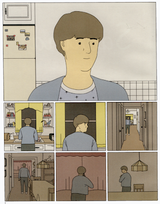
Nick Drnaso, "Keith or Steve", Mome #22 (August, 2011).
So, I'm doing something I haven't done in a long while: to review some comics I've read recently.
Which ones, you ask... Well, as I said last October 25, My Favorite Thing Is Monsters by Emil Ferris, Barcazza by Francesco Cattani, Sabrina by Nick Drnaso, plus, Rey Carbón [king coal - a nice translanguage pun] by Francesc Capdevila (aka Max) and Berlin by Jason Lutes.
I can't write anything about the first two because a) My Favorite Thing Is Monsters hasn't reach the end yet (I never write about unfinished stories) and b) my Barcazza edition is in color (I didn't buy the first black & white version, yet...).
That said I'll add just this: I found My Favorite Thing Is Monsters a bit annoying (facile, I would say; plus: if she's not copying a photo Emil Ferris can't really draw - hands especially - hence the "this is just a little girl's sketchbook" trick); on the other hand Barcazza seemed an Antonioniesque exercise to me, with a weird unexplained (or is it unexplainable?) sequence... In four words: I wasn't particularly impressed. Even so, my taste leans more to the classicism of Barcazza than to the baroque atmosphere of My Favorite Thing Is Monsters. Mainly also because my favorite thing isn't monsters.
On the other hand, Sabrina, Rey Carbón and Berlin are another thing altogether... but Rey Carbón and Berlin will have to stay on hold, for now...
Sabrina by Nick Drnaso
The first time I read a Drnaso story was in Mome #22. As it happens frequently, if a story doesn't impress us enough, and the reasons vary, from distraction, to a lack of connection with the theme, or the art style, or the mood, etc... we forget all about it. This meant that, yes, I forgot all about Drnaso... To put it bluntly: it was all the hubbub around the Man Booker Prize that made me try a Drnaso story again.
According to Anita Singh, at The Telegraph
The judges praised Drnaso's work as "oblique, subtle, minimal, unmanipulative" and said: "Given the changing shape of fiction it was only a matter of time before a graphic novel was included on the Man Booker longlist. Sabrina makes demands on the reader in precisely the way all good fiction does."Basically this means that we can't trust comics crits. In which alternative world do comics critics (with their praise for direct, blunt, baroque, manichean stories) find value in obliqueness, subtlety, minimalism, nonmanipulability? If there's one, I want to be there and forget all about the San Diegos and Angoulêmes of this world...
In "Keith or Steve" Drnaso did a couple of things of note: 1) the words (a voiceover, if I may compare comics to film) don't match the images exactly; 2) in the page above he shows an unremarkable character (is he Keith or Steve?, he doesn't know) in the first two tiers and compares him with idealized advertising kitsch; not only that, but we also learn in the captions about a certain woman - whose name he can't remember either - who's in narcotics anonymous).
In Sabrina there are no captions. There are no thought bubbles either. What we see and read in the speech balloons is what we get. Which isn't much, apparently, but what do we see, exactly?
No, it isn't a Tintin or a "Bringing Up Father" comic... but, hey, the continuous equal width lines, the flat colors... yep!, it's a clear line for the 21th century.
1) The art style...
...is the clear line. No other drawing style used in comics, so far, conveys detachment better.
Nick Drnaso used mostly muted colors. If we look at the "Keith or Steve" page above and notice the above mentioned contrast between a dull existence and an idealized life we can look at the colors in Sabrina in the same way. Only Cici's children's books, and not much else (the beach, and even then, the color shades are more pastel than garish; a shop window, ditto...) have bright colors... Plus: in the above page the layout is united in the first panel, and fragmented in the lower tiers. If we remember that religion means "reconnect," do I need to say more?...
To show us how alienated the characters are Nick Drnaso drew their eyes as two dots and not much else. The exceptions are few and far between, mostly in the virtual reality of the Internet (see above) or in the frontispiece illo in which Sabrina's portrait is more detailed. Another remarkable exception are Cici's eyes... children, again, are different...
4) Cats:
Aren't cats cool and detached?...
In Sabrina there's some sort of David Lynch effect which is described here by David Foster Wallace:
Lynchian refers to a particular kind of irony where the very macabre and the very mundane combine in such a way as to reveal the former’s containment within the latter.In Sabrina the effect is lynchian, with a nuance. Maybe there's no irony, maybe there's just a matter of factness that's even more creepy and reminds us of Annah Arendt's banality of evil. More than that, maybe nothing threatens us and we just fear fear itself in a world of simulacra where reality melted down leaving us in a constant state of detachment and/or paranoia...
Nick Drnaso, Sabrina, May 2018.


No comments:
Post a Comment