Thursday, November 12, 2009

Anke Feuchtenberger's Somnambule


Anke Feuchtenberger is a German graphic designer and comics artist. In a recent interview by Mark Nevins (European Comic Art, Volume 2, # 1, Liverpool University Press: 65 - 82) she talked about her influences (67, 68): "Well, I grew up in East Berlin, in a house full of art books. My father was a graphic designer, and my mother was an art teacher. So rather than children's books, I spent a lot of time looking at art books. These were strange books for a five-year-old girl, things like the posters of John Heartfield, books about Käthe Kollwitz and Rodolphe Töpffer, and collections of paintings from the Italian Renaissance. My father had a lot of catalogues from the 'Poster Biennales' in Warsaw and Finland, and I loved to look at those posters. I also really liked the work of some of the Renaissance painters, especially Matthias Gruenewald [sic] and Hieronymus Bosch. Those images filled my imagination every day. [...] One of my early very serious experiences with art came when I was 15 years old. I got up all my courage and visited a female painter I adored, and I showed her my drawings. Her name is Nuria Quevedo [http://www.galerie-berliner-graphikpresse.de/?page_id=153]. She's Spanish, and was in exile in East Germany." Anke Feuchtenberger also says, in the same interview, that she doesn't like Picasso's work. That's strange though: Nuria Quevedo's influence is easily traceable in Feuchtenberger's style, and Picasso's influence is also easily traceable in Quevedo's paintings. Quevedo did serious caricatures like, for instance, Chago Armada. I wonder if that's one of the usual features in Second World graphic artists. Maybe José Alaniz's book on Komics (comics from Russia: http://www.upress.state.ms.us/books/1199) will talk a bit about the subject. I also wonder who started doing that? My bet is Pablo Picasso, but I could be wrong (George Grosz and Saul Steinberg are other possibilities and Paul Klee and William Steig come to mind... but maybe Gus Bofa is the real name to cite here; I guess that an historical investigation is in order...). Anyway... there's a thin line between caricature and expressionism... It would be very difficult to determine which expressionist drawing is no longer expressionist, but a "serious" caricature and vice-versa... Besides, who can say for sure if William Steig's lonely ones (Duell, Sloan & Pearce, 1942: http://tinyurl.com/ygcwhln ), for instance, are funny or "serious," or both?...
Talking about one of her most famous books, with Katrin de Vries (Die Hure H, Jochen Enterprises, 1996; W the Whore, Bries, 2001), Anke Feuchtenberger seems to confirm the idea that her work may be labeled "feminist" (ditto: 81): "Her name [Die Hure H] should create fantasies about danger, pleasure, sexuality, and so on. We used the character as a door which opens up wide possibilities for thinking about the female body, the history of the female body, and the opportunities for a woman in society [...]."
The "message" in "Die see jungfrau" (the young woman from the sea, according to my translation: published in Die kleine Dame - the little lady -, Jochen Enterprises, 1997), a story also written by Katrin de Vries (and inspired by Hans Christian Andersen's "Den lille havfrue," the little mermaid, published in Eventyr, fortalte for Børn, fairy tales told for children: C. A. Reitzel, 1837), focuses on the politics of the female body. Unfortunately I don't speak German, but it seems to me that the young woman from the sea refuses her identity and wants to be a normal (or should I say: standardized) woman. In order to become one she doesn't hesitate to bleed to death because she cuts her fish tail in two.
Anke Feuchtenberger's Somnambule (an almost wordless book, by the way; Jochen Enterprises, 1998) goes the other way around destroying the simplistic feminist labeling... Here we can find one of Feuchtenberger's more recognizable visual metonymies: the detached (flying) head (strangely enough this is the second time that this metonymy appears at The Crib: the first one it belonged to - with some differences nonetheless - Edmond Baudoin). In "Gewächs haus," the greenhouse (a story inspired by Katrin de Vries), a man is the victim because, even if he tries to fly away using his propeller head, he can't do it. Two women keep him captive shaping him in their way, planting him, really (hence the title).
These stories are about power and domination, about killing what one loves (it's the mystery of the vowels again: another link to Edmond Baudoin: cf. my post about him). To confirm everything that I said so far you may read/see "Blind Schleich Song," something like "blind creep song," acording to an internet translator (a story that's part of Somnambule), here: http://www.feuchtenbergerowa.de/gal.htm (a male human caterpillar tries to flee using his head propeller, but the human female bunny character doesn't let it; the caterpillar's head detaches itself from the body functioning as the moon, or a night light; in order to read this story you just have to think about the caterpillar as a stage before a metamorphosis occurs - the body turns into a butterfly - and a head detaching from the body as a sign that the latter can be imprisoned - in this case: prevented from growing up -, but our imagination can't be contained; even so, the head loves the bunny because it stays with it nonetheless).
It downs on me now that this post should have been called something like: Anke Feuchtenberger's and Katrin de Vries' beautiful stories... The latter isn't really the author of Somnambule, but she greatly influenced Anke Feuchtenberger's work during the mid to late nineties.
She also deserves to be in The Crib's canon.

Anke Feuchtenberger's site: http://www.feuchtenbergerowa.de/
Anke Feuchtenberger's and Stefano Ricci's boutique publishing house: http://www.mamiverlag.de/

Images:
Somnambule's wraparound cover cut in two halves like the see jungfrau's tail (Jochen Enterprises, 1998): our old selves are falling behind us all the time while new ones are born...

PS Feminists are, to me, the best critics of mainstream comics writing today. This happens because, being mostly male, other critics overlook misogynous messages and buy every stupid fantasy that passes for art in mainstream comics. That said I strongly endorse a visit to this particular post ("Bingo: The Callers Enclue You") in Karen Healey's blog:

Girls Read Comics and they're pissed:
.

Thursday, November 5, 2009

Reviewing a Review


I began writing about comics in a fanzine published by my good friend Manuel Caldas: Nemo [in the subtitle's last version], O Fanzine Dos Que Gostam Da Banda Desenhada (Nemo, the fanzine of those who like comics - March, 1986 - June, 1998). This is a strange concept: no one likes music or cinema (i. e.: all music or all films). Anyway, it was back then, in Nemo # 21 (March, 1996), that I initiated my campaign against most mainstream comics (the exceptions being Carl Barks' duck stories, Matt Marriott by Reg Taylor, James Edgar and Tony Weare, lots of stories written by Héctor Germán Oesterheld and a couple of David Wright's Carol Day story arcs; I'm not sure if comics by Carlos Trillo and Alberto Breccia are mainstream or not). I tried to explain my reasons, of course... but Manuel wasn't kidding when he put that subtitle on his fanzine's cover: some people do like all comics, especially the mainstream ones (they think that alternative comics are badly drawn, so, I'm not sure if they like all comics or just the "for the youth from 7 to 77" kind). Needless to say that I was "the enemy within" subsequently ... I was bitterly expelled from the escapists' (aren't they all?) paradise...
Most of what I wrote back then I recently found in a review of Martin Sheridan's Comics and Their Creators (Hale, Cushman and Flint, 1942) by the New York Intellectual David T. Mazelon. It was published in Dwight MacDonald's Politics magazine (May, 1944: 117 - 118). Unfortunately some of us are condemned to reinvent the wheel, I suppose...
Bazelon opens his review writing that: "Mr. Sheridan has something to say about some seventy-five comic strips. But what he says is singularly unimposing. Each of these strips is covered by a thumbnail biography of the creator, or an interview in the worst newspaper manner. The histories of the cartoonists and their work are presented by banal anecdotes, salary figures, and relative merits at golf. Sheridan's understanding of the comics and the men who draw them really seems to be limited to a hungry appreciation of their salaries." This is a criticism of the author's approach (from the point of view of the social critic and art lover), not a critique of American newspaper comics and comic books (that comes later). (Bazelon also quotes Sheridan's publishers when they say that his book will appeal to "every young-minded American" - it's the "from 7 to 77" cliché again -; he counterattacks stating the existence of the "undiapered reader;" as a huge fan of the "babymen" epithet I have to add that I laughed with gusto when I read the expression.)
He goes on quoting Sheridan and sandwiching comments: "The comics cartoonist "is expected to please everybody." He believes that readers "will follow the strip which offends no one." With these directives, the tendency, of course, is to produce vacuous stereotypes." I could not say better...
I also agree with Bazelon's aesthetic ideas (if they were born with Romanticism, so be it): "One of the greatest effects of good art is to make people see themselves differently, by identification in new, fruitful perspectives. This is the other side of artistic creativeness, for it is the expression of such perspectives which provides the artist's essential worth. However, when the needs of class control determine the material of art, and when these needs are reactionary and disease-like, creativity is sharply limited or completely smothered. Art is dangerous; it tends toward freedom." In the highly commodified world of the 21th century this statement seems a bit naive, but I believe in its core idea: the stereotype can never be great art. And mainstream comics are stereotype-ridden...
To see how the New York Intellectuals changed their minds about mass consumption of the arts from 1944 to 1960 we just need to compare these two quotes... Bazelon (being a revolutionary idealist): "This approach [by Sergei Eisenstein who roughly says that if we give something good to the people they will like it] conflicts with the Philistine attitude that good art is for a small section of the population, while any trash can be tossed to the masses." MacDonald (being a post-revolution realist): "the great majority of people at any given time (including most of the ruling class for the matter) have never cared enough about such things to make them an important part of their lives. So let the masses have their Masscult, let the few who care about good writing, painting, music, architecture, philosophy, etc., have their High Culture, and don't fuzz up the distinction with Midcult." ("Masscult & Midcult," Against the American Grain, Vintage Books [Partisan Review, Volume 17, # 2, Spring, 1960 - Volume 17, # 3, Summer, 1960], 1962: 73). As Neil Jumonville put it: "[the New York Intellectuals] disliked mass culture partly because the working class never turned out to be as revolutionary, noble and cultured as radical intellectuals had hoped. Some of the Partisan group had assumed that, if unimpeded by capitalist commercial values, the mass of citizens would voluntarily seek out high culture themselves. When it became evident that would not happen, most New York Intellectuals deplored middlebrow as much as lowbrow culture." (The New York Intellectuals Reader, Routledge, 2007: 205.) Pierre Bourdieu confirmed scientifically what Dwight MacDonald suspected: high culture is not the culture of the dominant class, high culture is the culture of the dominated fraction of the dominant class (La distinction, Les Editions de minuit, 2002 [1979]). In a word: the intelligentsia. Large parts of the dominant fraction of the dominant class have middlebrow or even lowbrow taste because these "things" are not "an important part of their lives."
Bazelon likes Krazy Kat by George Herriman and that's about it. I put no American newspaper comic strips in my canon, but being forced to do it I would also choose Krazy Kat (see header above), some Sunday Pages from Gasoline Alley by Frank King (the dailies' story arcs seem as bowdlerized as the Sunday Pages, but they're not half as poetical), Dot and Dash by Cliff Sterrett (for their formal ingenuity), some Skippy by Percy Crosby (and not Peanuts... having to choose between the master and the apprentice I choose the former), but not much else... David Bazelon condemns Bringing Up Father (by George McManus): "[Jiggs] prefers corned-beef-and-cabbage and poker with the boys to the life that wealth offers. The sop here is patent[;]" Radio Patrol (by Ed Sullivan and Charles Schmidt) because: "Almost tautologically, art serving banalities itself becomes banal" (I'm not sure if I agree with this one, but that's a story for another time); The Timid Soul (by H. T. Webster): "an extreme caricature against which the pin-point ego of any harassed petty-bourgeois can release itself."
After saying that "Politically, Superman is a pre-fascist creation" David T. Bazelon ends his review contradicting what psychiatrist Lauretta Bender (who was part of Superman's publisher, National Comics' - later DC -, editorial board) has to say about said character: "(He) would seem to offer the same type of mental catharsis Aristotle claimed was an attribute of the drama." Bazelon: ""Superman" gives vicarious satisfaction to explicit social frustrations. It cannot be tragic or displeasing, nor can it contain that essential realism which is a quality of all good art. For it has a purpose: this is art in the service of social neuroses. And that service is the meaning of most comic strips... Pearls are produced not by serving but by opposing disease."

Image:
The cover of Politics, May, 1944.

PS A page about David T. Bazelon: http://www.lib.udel.edu/ud/spec/findaids/bazelon/index.htm#bio

PPS This is post # 100. I'm amazed that I arrived this far, really...

Monday, October 19, 2009

Yvan Alagbé's Nègres jaunes - Coda

1.

2.

3.

4.

5.

6.

7.

8.
Images:
1. The page layout as a meaningful device: the triadic rhythm in Jacques Tardi's C'était la guerre des tranchées refers to the French flag (as exemplified here by page 48 in Casterman's graphic novel, 1993);
2. in Jacques Tardi's latest book about WWI (Putain de guerre - fucking war -, Volume 1, Casterman, 2008; with Jean-Pierre Verney) he repeats the same mechanism, but... since Tardi also focuses on foreign soldiers (no problem when representing the Germans because their flag is also tricolor) it doesn't work when he depicts the Brits (the Union Jack isn't); in this particular page (8) soldiers are compared to sheep heading to a slaughterhouse: "Human meat was needed to satisfy the insatiable appetite of our masters! / Meat was needed to feed those who were going to die disemboweled, with their bellies still full of the beasts' smelly warm meat! / Meat was needed, it was unavoidable, because they turned us into slaughterhouse sheep!" - the tone of the text has a Celinian touch (my translation);
3. the series of drawn blank pages in The Cage by Martin Vaughn-James to which the previous double-page spread belongs: as published in La Cage, Les impressions nouvelles, 2006 (unpaginated); translation by Marc Avelot;
4. Yvan Alagbé changes his drawing style abrubtly in the last panel of page 26 of "Nègres jaunes"' second episode (Amok, Le cheval sans tête # 4, January, 1995);
5. Comparing these two panels (the first one published in the serialized version of "Nègres jaunes" - Le cheval sans tête # 5, May, 1995: 38) it's safe to conclude, I guess, that Yvan Alagbé created the subjective, racist, representation of Alain when he decided to redraw the whole story (the second panel was published in the graphic novel of the same title: Amok, 1995); note also how Yvan Alagbé simplified the panel;
6. Claire is "color blind" only when Alain says that he doesn't want to marry her just to get a green card (Le cheval sans tête # 5, Amok, May, 1995: 39);
7. Mario's mother mumbles something unintelligible, but looking at how she obliterates Alain's face, we know what she's saying: Nègres jaunes, Amok, 1995;
8. Mario rambles about how the world should be organized in order to function properly ("[...]each in their place, it all works better like that..." - translation by Ellen Lindner and Stephen Betts); looking at the second panel we have no doubts about Martine's place (Nègres jaunes, Amok, 1995).
Nègres jaunes is unpaginated.

PS I read in a couple of www pages some "outraged" comments (the word is too strong, hence the quotation marks) because I said that "Chris Ware's comics in The ACME Novelty Library # 18 are not mass art." I will not deny that I tend to prefer what's usually not considered mass art, but, in this case, if I remember correctly, I was just underlining the story's focalization in the main character's subjectivism, the story's lack of spectacular actions and Chris Ware's assertive layout style. There's absolutely no value judgment attached whatsoever...

Tuesday, October 13, 2009

Yvan Alagbé's Nègres jaunes

1.

2.

3.

I read a lot of essays, reviews, articles about comics over the years... Sadly these still form most of my "to read" pile (I say "sadly" because, time not being stretchable and all... comics criticism expelled poetry, for instance, from my reading habits; yes Lídia, if you're still there, this still happens!). Comics scholars come from a few different fields and I enjoy every approach, but my favorite one is the formalist with a link to content (i. e.: someone who discovers a clever formal device with a communicative purpose that I, in my absent minded reading - or, some would argue, if they cared, my I. Q. impaired condition -, had not noticed).
From the top of my head I remember a few essays of the aforementioned kind by: Jan Baetens (about Hergé's Le secret de la Licorne - The Secret of the Unicorn), Pascal Lefèvre (about Kiriko Nananan's "Kisses"), Thierry Gröensteen (in his book The System of Comics), Joseph Witek (about Dean Haspiel's "91101" and a Brian Biggs' untitled short 9/11 story - even if I don't buy his essentialism entirely), Bruno Lecigne (about "La bascule à Charlot" - the guillotine - by Jacques Tardi, for instance), Pedro Moura (about Dominique Goblet's Souvenir d'une journée parfaite - remembrance of a perfect day)... you know?, the heavy weights!... but also by others that are more obscure critics (like Sylvianne Rémi-Giraud about Fabrice Neaud's Journal). Even so there were three occasions in which I said to myself: wow!, that's impressive! I mean:
1) Jacques Samson, "Stratégies modernes d'énonciation picturale en bande dessinée" (modern strategies of pictorial enunciation in comics) in Bande dessinée récit et modernité (comics, narrative and modernity), Futuropolis, 1988: 117 - 138; in which the author discovers a triadic rhythm in Jacques Tardi's C'etait la Guerre des tranchées ("It Was the War of the Trenches", published in English by Drawn & Quarterly - in Drawn & Quarterly Vol. 2, # 1 - 3, Autumn, 1994 - May, 1995; translation by Kate Sibbald; originally published as a graphic novel by Casterman, 1993, after prepublication in (A Suivre) magazine (to be continued - # 50, 53, 54, 58, 1983, # 181, 185, 189, 1993, and Le trou d'obus - the shell hole - Images d'Epinal, 1984); most of C'était la guerre des tranchées' pages are composed of three equal strips as wide as the hyperframe; Jacques Samson links this layout (and other triadic instances) with the French flag, the tricolor, which symbolizes the values of the French bourgeois revolution (liberty, equality, fraternity): grand words totally subverted in this absurd war (WWI); in the end what really happens in most wars is that poor people die to defend rich peoples' interests (soldiers die to defend the right of their people to be exploited by someone talking their own language?);
2) Marc Avelot, "L'encre blanche" (the white ink) in Bande dessinée récit et modernité (157 - 173) in which the author does a close reading of a blank double-page spread (!) in Martin Vaughn-James' The Cage (Coach House Press, 1975); in a book about how ephemeral and inadequate our communicating devices are, how can the writer/artist be self-referential about the book and the page?; as Marc Avelot pointed out in the aforementioned essay it can be read as a real page - in Saussurian terms a signifier - that's also a fictitious page - a signified); the thing signifies (it stands for) itself: Vaughn-James managed to write with no ink, hence "the white ink" of the essay's title; brilliant!;
3) and more recent: Hugo Frey, ""For All To See": Yvan Alagbé's Nègres jaunes and the Representation of the Contemporary Social Crisis in the Banlieue" in Yale French Studies number 114: Writing and the Image Today, 2008: 116 - 129. Hugo Frey comments that the black people's faces in the book are depicted by thick black brushstrokes when they're with white people (the gaze of the racist who's obsessed by color) and they're just outlined when they're among each other. (I will refine his thought saying that there are degrees of racism and "color blindness" in the book: Mario's mother is the worst racist and Claire - a revealing name -, Alain's girlfriend, is the least racist; even if she dates a black man she's not totally oblivious of his skin color...)
"Nègres jaunes"' (yellow black people) first version was published in Amok's Le cheval sans tête magazine (the headless horse) # 3 - 5 (October, 1994 - May, 1995). It was considerably altered by Yvan Alagbé for the definitive album edition (Amok, October, 1995).
The characters are all a bit lost in Nègres jaunes because they have to adjust to an hostile new culture. Mario is an ex-harki, an Algerian who sided with the French during the Algerian War (1954 - 1962). He's also a very lonely old man who is in denial of his latent homosexual desire for Alain. The latter belongs to a Beninese family who suffer because of a racist society and because they've lost their roots (Sam, the draughtsman, an Alagbé's alter ego?, we don't know that well; he's a very private person, lost among his drawings, lost in his own fantasies). I may be wrong (if one can be wrong when interpreting a polysemic text), but that's how I decode the title: African immigrants living in Europe didn't turn white, but they're not entirely brown anymore, they've been a bit bleached, they're "yellow." No one in the book is more "yellow" than Mario though... He wants desperately to reconnect with Africa, but he can't... Like Adam expelled from paradise after the original sin, Mario can't be a true African again after being a traitor. Traitors, as Dante reminded us, were put on the ninth and last circle of hell... their sin, like Judas Iscariot's, the worst traitor of them all, can't be redeemed... Despised by both sides their exile is absolute because it is an exile from the human race...

Images:
1. Jacques Tardi's "C'était la guerre des tranchées" as the cover of (A Suivre) # 185, June, 1993;
2. Martin Vaughn-James explains in this drawing how to link a The Cage blank double-page spread with the next one in order to interpret the former as a page that signifies itself because it turns out to be an extreme close up of one in a series of drawn pages: Bande dessinée récit et modernité, Futuropolis, 1988: 172.
3. Nègres jaunes' cover: Amok, October 1995; Alain is torn because Claire is his sun, but she's a cold sun ("he dreams of women with wide hips" - translation indicated bellow; all other translations are mine except for Hergé's book title, "It Was the War of the Trenches," "The System of Comics.")

PS Ellen Lindner and Stephen Betts translated Nègres jaunes:


Monday, September 28, 2009

Carlos Roume


The Crib is one year old, but, unfortunately, I'm not in the mood to celebrate because, according to Mariano Chinelli at the Eternautas discussion list, Carlos Roume passed away last week. I'm very sorry because another of the greats has disappeared. I love his work (I think that he's highly underrated - almost no one cared enough to talk about his passing), but I never met him... Now I never will...

Images:
Another great comics artist (a writer: Héctor Germán Oesterheld, I bet...) says goodbye to Carlos Roume when he left Argentina to work for Fleetway in England (Frontera Extra # 11, September, 1959). He says, among other things: "He's going away, but "his" Old Homeland [Oesterheld plays with the title of one of their series: "Patria Vieja"] goes with him. He wants to turn our gaucho themes famous in Europe. We are sure that he will succeed. He has more than enough talent to do it."
It seems to me that Oesterheld was wrong though: as far as I know Carlos Roume never found another writer like him. As many others during most of the 20th century he may very well have wasted his talent doing mediocre genre comics for children...
A more recent portrait of the maestro, found here: http://tinyurl.com/yb96z8b (photo by Rubén Pinella, Tandil, October, 2007).

Rius' Las historietas (Los Agachados # 66) - Coda

1.

2.

3.

4.

5.

6.

Images:
1. Las historietas starts with an highly flawed history of the medium; in this first image Rius almost falls into the temptation of what I call the nationalistic fallacy (he says that the first comic was created in Mexico: it's the codex Borgia: http://tinyurl.com/y8dse9n)...
2. ...but he refrains himself saying that the first comic was published in Germany by Wilhelm Busch: Bilder zur Jobsiade (pictures to illustrate the saga of [Hieronymus] Jobs; my flawed, I'm sure, translation); not only did Rius say that the book was published in 1860 (predating Max und Moritz - 1865; Bilder zur Jobsiade was published in 1872), he also ignored Rodolphe Töpffer (and I must add the disclaimer that I don't believe that Töpffer did the first comic); other names were ignored and facts mistaken;
3. even if Rius liked some American comics (Prince Valiant, for instance) he had a strong dislike of the superhero genre: "With Superman comics began to "degenerate." They became the herald of violence; of collective (and productive) stupidity" / "Be tough with him: he's a poor pinko!!" (my translation as in 4., 5., 6.);
4. "After the superheroes came the supercowboys, the superdetectives, the super-secret agents, the supermonsters... All perfectly and cinematically executed.. In a veiled or openly biased intention against Blacks, Latinos, Yellow or Red people." / "We White people are the only goodies!" / "In all American comics the hero is always white.. and the baddies are always Blacks, Mexicans, Chinese, Russians, Cubans [are these red?, ed.], or Redskins.. (When they're not baddies they're idiots or lazy)."
5. I'm no expert in comics from the former communist countries, but we seem to have to believe Rius' word when he sez that great comics were produced in Czechoslovakia, Poland, et al!... I agree with more than one of his criticisms (as you can guess reading The Crib), but this manichean belief that everything was bad in Capitalist countries (and Rius doesn't say that, mind... as I said before he states his fondness for a few American comic strip series) and everything was great in the so-called communist countries is far from an intelligent and critical position...
6. Rius also wrote in Las historietas about Mexican comics; he's critical of them because either they're imported from Gringo country or they're done in Mexico copying Gringo's ways; "In the same way as fumettis [telenovelas] Mexican comics serve the publishers' only interest" / "To sell." / "And what sells? What's gruesome, vulgar, what gives people violence, sadism, "love," false values, fantastic adventures, in a word..As Mr. Bertrand Russell (R.I.P.) put it: Opium of the best quality!"

Thursday, August 13, 2009

Rius' Las historietas (Los Agachados # 66)


Eduardo del Rio (aka Rius) is a left wing Mexican political cartoonist who edited two comic book series: Los supermachos [the supermachos - one hundred issues: 1964 - 1967 - in Spanish: http://supermachos.toliro.com/] and Los agachados [the stooped ones - two hundred and ninety two issues: 1968 - 1977: Bob Agnew's translation, here: http://tinyurl.com/p2dsh8 (I also saw this title translated as "the underdogs")].
"Las historietas: El método más barato para embrutecerse... (o cultivarse... según...)" [comics: the cheapest way to stultify oneself... (or to cultivate oneself... it depends...) - my translation] is issue # 66 of Rius' Los agachados. It was published on april, 4, 1971, by Editorial Posada. In the first page of the comic book Rius wrote: "Historieta hecha por la tribú Rius © 1969." This suggests that Rius wasn't the only person involved in the creation of this essay in comics form.
Cultural studies is a discipline that started in England by the hand of Richard Hoggart during the fifties. Even if it mostly relies on almost the opposite view now (mainly because of theories developed around Bowling Green University in the United States), Hoggart "lament[ed] the loss of an authentic popular culture and [...] denounc[ed] the imposition of mass culture by the culture industries." (As we can read in his wiki entry: http://en.wikipedia.org/wiki/Richard_Hoggart). The previous decade Dwight MacDonald expressed the same ideas in his mag Politics (there's also the Frankfurt School, Max Horkheimer and Theodor Adorno: http://tinyurl.com/oqxtqk). Rius follows these views, but he was a comics artist so, he has to see some good in comics too (ditto Umberto Eco, more or less around the same time). What he denounces are the violence and stupidity of some comics made in U.S.A. (superhero comics, mainly; in France he denounces the cheap use of sexploitation), the greediness of publishers and the stupidity of the audiences: "Mientras peor es la pelicula. Más larga es la cola..." (the worst the film is, the longer the line to attend it - my translation).

Anne Rubenstein's Bad language, naked ladies, and other threats to the nation [about Mexican comics]: http://tinyurl.com/qb4ft8

Image:
Los Agachados # 66 (cover, April, 4, 1971). Alley Oop, a caveman (!), is at the helm of the comics ship.

PS The Crib is on a hiatus, but I hope to return to work in September (in almost a year I did only half of what I intend to do with it).

Wednesday, July 8, 2009

Martin Vaughn-James


This is the stuff life is made of, I guess... I'm sometimes happy at The Crib for receiving a brilliant original page (like that Carlos Roume one, just the other day)... sometimes, like today, I'm very sad because another artist in my canon passed away. Tom Spurgeon at The Comics Reporter announced the passing of Martin Vaughn-James: http://www.comicsreporter.com/index.php/martin_vaughn_james_1943_2009/
This is a text that I wrote for the Summer, 2004, issue of Indy Magazine online (by the way: many thanks to Bill Kartalopoulos for being such a great editor at a time in which I had a bit of a writer's block): http://www.indyworld.com/indy/summer_2004/isabelinho_cage/
What can I say more, but thanks Martin?!... I'll never forget you!...

Images:
Martin Vaughn-James' The Cage's cover (Coach House Press, 1975; a little strip is missing at the bottom); Martin's inscription in my copy of The Cage: For Domingos, in Lisbon, city of dreams..

Sunday, July 5, 2009

Repros - Coda

1.


2.

3.

4.
5.

6.

7.
8.

9.
Images:
1. a Prince Valiant (by Hal Foster) panel as published in a Portuguese edition (Príncipe Valente, volume 1, Editorial Presença [presence publishing house], 1972); what a mess!... (and, yes, in case you're wondering: the panel was published crooked as shown);
2. when I first saw my good friend Manuel Caldas' Príncipe Valente edition (Livros de Papel [paper books], 2005) I thought: I've been disrespected by publishers who were selling comics in about the same way as they very well could be selling potatoes (and they would sell rotten potatoes if people were dumb enough to buy them: are comics readers somewhat less bright than potato buyers?, I guess so...); if you like Hal Foster's art (or Warren Tufts') do yourself a favor and buy Manuel's editions in Spanish and Portuguese (http://www.manuelcaldas.com/) or in English (http://tinyurl.com/l8qcxr; http://tinyurl.com/l252ck: scroll down a bit, please...); these are labors of love; (only now, after all these years, did I notice that Hal Foster used aerial perspective in this spectacular image!, thanks Manel!);
3. a Winsor McCay self-portrait as published in Winsor McCay Early Works Volume VIII (Checker Books, 2006); nothing excuses such bad resolution and such bad design and production values!;
4. the same drawing as published in John Canemaker's Winsor McCay His life and Art (Abbeville Press, 1987); it's not Manuel Caldas repro quality, but, at least, it's a decent one;
5. this is a messy edition of Héctor Germán Oesterherld's and Alberto Breccia's Mort Cinder (Colihue, 1997); the repro quality is not the only problem: notice how a balloon content mysteriously disappeared in panel four;
6. the same page as in # 5. above as published in the excellent Italian edition: Mort Cinder, Sacrificio alla luna, L. F. Bona Editori, 1977; the repro is so good that it maintains an original art feel;
7. the last panel of an absolute comics masterpiece: "Un tenente tedesco" [A German Lieutenant] by Héctor Germán Oesterheld and Hugo Pratt (Mondadori, 1976 - one of two pirate editions; the other one was by Ivaldi); not only was the panel published crooked as shown, it also lost almost all the washes (the lines aren't that greatly reproduced either);
8. the same panel as originally published in Hora Cero (monthly) # 3 (July, 1957); no comments needed... (the original title of the story is "Un teniente alemán..."; as an aside: I can't understand why the Laconia became the Lacinia either?, it's not even a case of laconism...);
9. people blame technology sometimes (or the lack of it) for bad repro, but how can a body explain this superlative color edition of Flash Gordon done back in 1980!?, Flash Gordon, Le peuple de la mer (Slatkine B. D.); the only thing that I know is that the book was printed in Switzerland; if anyone can give me more details I will be much obliged...

Monday, June 29, 2009

Repros

1.

2.

3.

4.


5.

6.

7.

8.

9.

It's great at my crib, pardon me, at The Crib, when I can get my greedy, fetishist, mitts on some original art mentioned in my canon or thereabouts. Unfortunately these occasions are very few and far between because, either these artists aren't selling their art at all or I can't afford it.
Anyway, last June 23 was a happy day for yours truly indeed because I received from Mauro Barreiro in Argentina (don't forget to visit his CAF - Comic Art Fans - gallery at http://www.comicartfans.com/GalleryRoom.asp?GSub=67500) a Carlos Roume page from Nahuel Barros' last story in Hora Cero Suplemento Semanal (# 92, June, 4, 1959; it's the 28th page of the story) and a stunning Alberto Breccia portrait. Looking at these beautiful drawings I found myself thinking about how bad repros have been and how carelessly publishers have treated comic art. In the next coda I'll post some more good and bad examples...

Images:
1. original drawing by Carlos Roume and...
2. ...published repro: Carlos Roume drew with a thin brush on light weight matte, coated paper; this technique gave his lines a wonderful impressionistic fluidity; the lines' values vary from light grey to deep black; all this is lost in the repro on cheap pulp paper;
3., 4., 5., 6., 7., 8. more examples;
9. a wonderful felt-tip pen drawing by the great Alberto Breccia (done 23 days before he died).

Saturday, June 13, 2009

Chris Ware's The Acme Novelty Library #18 - Coda #2

Images and Sounds:
A Chris Ware's Quimby the Mouse animation by John Kuramoto; music: Eugene by Andrew Bird.

Friday, June 12, 2009

Chris Ware's The Acme Novelty Library #18 - Coda #1

1.

2.

3.

4.

5.

6.

7.

8.

9.
Images:
1. "Ticonderoga"'s first two pages (two tiers each in landscape format) by Héctor Germán Oesterheld and Hugo Pratt (Frontera mensual [frontier monthly] # 1, April, 1957); In the first caption we can read (my translation): "I was hit by a bullet in the head on September 4, 1812, when Captain Decatur, in command of the "United States," captured the "Macedonian," one of the most powerful British frigates;" at a certain point the story is a long flashback narrated by a seventy five year old Caleb Lee; the first person narrator violates one of Greimas' three rules to define mass art (socio-literature): the non interference of the narrator (this is, however, the only rule that Oesterheld dared to break: sometimes I wonder if Oesterheld knew that he could do a lot better, but refrained himself from doing so because he was writing for children?); we can even see Caleb Lee in the next page, but that's a problem: if we're in first person mode, how can we see him?...; when a comic is constructed using the polyphony of words and images there's always the possibility of two simultaneous narrative modes; in the case above the homodiegetic narrator (Gérard Genette: Figures III, Seuil: 225 - 227) in the captions contrasts with the, apparently, heterodiegetic narrator of the ocularization (André Gaudreault and François Jost, Le récit cinématographique [narrative in film], Nathan Université, 1990: 129) - excepting the third panel of the second page, clearly a subjective point of view; in the last panel of the second page Caleb addresses the reader (even if in a slightly slant way), s/he is the one who ultimately sees: the problem is that the reader can only watch what Caleb narrates; on the other hand, could Caleb see the roofs in the first panel of the first page?, or his granddaughters in the fourth panel of the second page?; certainly not: he could only imagine such things; in the end, if the narrator is Caleb Lee, we must also consider other instances: above all, André Gaudreault's meganarrator (Du littéraire au filmique: système du récit [from literature to film: the system of the narrative], Méridiens Klincksieck, 1988:113);
2. detail of "Binky Brown Makes Up His Own Puberty Rites" by Justin Green as published in Binky Brown Sampler (Last Gasp, 1995 [Yellow Dog # 17, 1969]); one of the first autobiographical underground attempts is completely heterodiegetic in a traditional way; even so it's successor Binky Meets the Holy Virgin Mary (1972) remains one of the milestones of the history of comics; the hairy title is one of those iconic-diagrammatic signs that underground artists seemed to like so much;
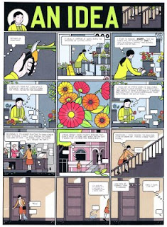
3. "An Idea" by Chris Ware (The ACME Novelty Library # 18, The ACME Novelty Library, 2007) mimics old newspaper comics pages with their mastheads (Daniel Clowes did the same thing in Eightball # 23, Fantagraphics, 2004; Chris Ware is always juggling with traditional aspects of the art form and innovative ones); again, the ocularization is the meganarrator's point of view, but there's no verbal narrator; what happens is that there's an internal focalization since we can read the main character's thoughts; plus: quoting Joris Driest (Subjective Narration in Comics, Secret Acres, Critical Ends: http://www.secretacres.com/snicone1.html): "Film images are commonly focalised. Point-of-view shots [...], in which the viewer literally adopts the spatial orientation of a character seem the ultimate example of it. However, focalization is not restricted to these point-of-view shots. A shot from a neutral (non-character) angle can still have elements originating from character experience. [Edward] Branigan ([Point of View in the Cinema: A Theory of Narration and Subjectivity in Classical Film, Mouton,] 1984) notes that 'the look of the viewer is not equivalent to that of the camera'. […] Thus we may very well see space from a neutral angle while simultaneously holding an aspect of that space – say, colour – apart from the image and attributing it to a character’ (96). A classic scene is that of a thirsty man seeing an oasis in a desert. As he tries to dive in the water, the fata morgana disappears, and he lands in the sand. A viewer sees both the man and the oasis from a neutral angle, but still understands that the image of the oasis originates from the man’s mind;" this is a kind of subjectivity that's used a lot by Chris Ware in The ACME Novelty Library # 18: in "An Idea" we see empty word balloons attributed by the main character to all sorts of plants... and the cat too...;
4. in "A Feeling" (The ACME Novelty Library # 18) Chris Ware plays with the fragmentary side of the comics layout to perfectly convey the awkwardness felt by the character towards her body; Chris Ware placed the drawings in the panels strategically to allow (or force) a tabular reading: strange changes of scale from panel to panel glue the character's limbs to her body in a very strange way; if we look again nothing stranger than different framings mixed together is occurring (the ninth panel is different though: since the balloon has white lettering over a black background indicating that she has her eyes closed -, this scene was imagined by the character - see above);
5. in this page (also from The ACME Novelty Library # 18) we can detect Belgian artist Edgar Pierre Jacobs' influence; according to Renaud Chavanne (my translation): "[in Jacobs] the principles of composition [of the layout] are organized at the level of the strip in the first place without forgetting the page and, sometimes, the double-page" (Edgar P. Jacobs & le secret de l'explosion [Edgar P. Jacobs & the secret of the explosion], P.L.G., 2005: 259); Jacobs used the method of dividing the panels to create reading rhythms, guiding the reader through a sort of maze; here we can see five strips (with some fragmented panels - others are the result of a fusion of the gutter) that both convey the monotony of what's happening and the diversity of the imagined situations (again): the character "changes" clothes, she's sleeping with her boyfriend again, she's on a different bed, she's a child again, etc...
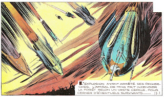
6. a page from "Le secret de l'Espadon" (the secret of the Swordfish) by Edgar-Pierre Jacobs, Tintin magazine, third year, # 8 (February, 19, 1948); the three strips are clearly visible and the use of fragmentation to convey a rhythm (and the passing of time with the images of the clocks) as well as to reinforce the changing perspectives helps to explain some of Chris Ware's more intricate page layouts; Jacobs also payed a lot of attention to symmetry (the two men in the first strip, the similar forms of the mountain and the submarine in the second, the two images of the same plane in the third); as for focalization and ocularization this is a seventy five percent traditional, children's comics page (there are three subjective points of view: panels two, five, eight - symmetry again); in a good action comic manner the meganarrator seems to have gone mad, jumping all over the place; (Edgar-Pierre Jacobs is part of what I call, the great stylists: their work can only be appreciated for their formal qualities, nothing more; for instance, here we can detect the racism that's in so many comics for children: in this particular case: the yellow peril.);
7. the first page of "Monotony" by Bernard Krigstein (as published in Crime SuspenStories # 22, February, 1998 [Crime SuspenStories # 22, April / May, 1954]); here we can see the same repetition of the point of view (the opposite of the action packed Jacobs page) to help to convey boredom as seen in so many Chris Ware pages;
8. page from l'Ascention du Haut-Mal (Epileptic) Vol. 4 by David B. (L'Association, 1999); David transformed Jacobs' strips into a whole page; the reading path has the form of an "N" with the counter slashed left to right, bottom to top; thus, the reader encounters the guts of Jean-Christophe and his heart before arriving, at the end, to David's penis pissing; jealousy is a gut feeling: instead of being just a layout virtuoso, like Jacobs, David B. (and Chris Ware) go way deeper than style and surface;
9. in this masterpiece of comics layout composition (The ACME Novelty Library # 18) Chris Ware doesn't limit himself to suggest a reading path, he clearly indicates it; the closed hand is a metaphor for the character's heart, but it also serves indexical purposes pointing to the two last panels of the first strip; at the end of the aforementioned strip we see another subjective point of view (the birds); then the black arrow sends us back to the left side of the page; after that, and following a white arrow, we go directly to the heart at the center; here, something spectacular happens: we have to beat our tendency to obey indexes going against our will and against another white arrow (plus: there's a menacing black circle waiting); now another arrow leads us to two images of the character masturbating and two images of absence at the bottom of the page; then we continue a path that leads us from the character's rectum to her head; going to the left side of the page (following a red arrow) we end up in a foot shaped like an erect penis; from health, or the lack of it, to libido (or libido repression; the "no, broken" that we read immediately can be interpreted in two related ways: what broke was her leg and her heart; that's why she fantasizes with childhood, a time when she was whole) to stream of consciousness daydreaming; Chris Ware strips his character to the bone, as seen in this page, but he also gave her a distinct voice, a life story, and a fleshed out personality rarely seen in comics form.