Monday, November 28, 2016

Micharmut 1953 - 2016


Juan Enrique Bosch Quevedo (aka as Micharmut) had to be a comics artist because his last names included the surnames of both a famous painter and a great writer. And what a great comics artist he was! Coming from the Valencian clear line school, with Mique Beltrán, Daniel Torres and Sento, Micharmut was a lot more inventive and avant-garde than his peers. I remember him from the pages of Medios Revueltos (where he signed J. Bosch) and Nosotros somos los muertos, but I also include a page from Besame Mucho, for good measure, below. Micharmut died yesterday.


Micharmut, "El hombre que veia insectos" [the man who saw insects], Medios Revueltos # 1, Spring 1988.


Micharmut, "Historias muertas" [dead stories], Nosotros somos los muertos # 2, May 1996.


Micharmut, "Caza mayor" [big game], Besame Mucho # 5, September 1979.

Sunday, November 13, 2016

Restoring Hope


José Muñoz, Buenos Aires, 6 de Mayo 1955.

José Muñoz me ha enviado la ilustración arriba como respuesta a mi entrada Restoring Sgt. Kirk. Es el dibujo que ha servido como afiche al tercer Festival Comicópolis del año pasado en Vicente López.

He aqui su comentario:
El Misterix del dibujo es el 345, del 6 de Mayo de 1955. Es el penùltimo a aparecer en tu muestra de restauraciones. Esto si que es Restoring Hope, dirìa yo.

Tuesday, November 8, 2016

Kirby, Who?

While an entire history of critics from Matthew Arnold to Harold Bloom have sought to identify excellence as an intrinsic and objective element, we contend that excellence is not a property of works but a judgment asserted on their behalf.
 Bart Beaty and Benjamin Woo, The Greatest Comic Book of All Time, Palgrave, 2016, 3.
Maus may not be intrinsically the greatest comic ever published, but that is a perfectly credible claim to make on its behalf.
 Bart Beaty and Benjamin Woo, The Greatest Comic Book of All Time, Palgrave, 2016, 94.
Ninety one pages are a lot of pages, apparently. In any case ninety one pages are enough to forget what we have written on page three.

I'm now on page ninety five of the above cited book, but I don't have much to add to my previous post.  The Greatest Comic Book of All Time seems, at times, like a fan history of American comic books instead of an academic essay (subtract the fan history and what you get is a slim pamphlet; ironically it should have been published in a comic book instead of a graphic novel format). But that's not what really bothers me. What really bothers me is this: Beaty and Woo appropriated features (quality signifiers, as they call them) for literature that don't belong to any art form. How is it possible to say that valuing a serious narrative with good characterization is valuing literariness? Do you really want to know? Because lit critics are smart and art crits are dumb, that's how. Let's suppose that the two fields are so far apart as Maus is from Youngblood or the Fantastic Four. This would mean that comics critics with a visual bend would value silly stories with cardboard caricatures.

Oops! They do! This is awful, Beaty and Woo are right!

I wish I could say to you that I was kidding above, but unfortunately I was not. Apparently, in the strange world of comics criticism, lit critics are smart and art critics are dumb. What I don't accept though is that narrative in comics is literature's monopoly (re. characterization, cf. last post). If that's true how do you explain the work of Frans Masereel, William Gropper or Martin tom Dieck, for instance?...


Frans Masereel, Mon livre d'heures [Passionate Journey], A. Kundig, 1919.

Saturday, November 5, 2016

Crumb, Who?


Bart Beaty and Benjamin Woo, The Greatest Comic Book of All Time, Palgrave, 2016.

I've read just two chapters of the above book. Since this blog is about my personal comics canon (something that can't exist, of course, because a canon is a social construct, ergo it can't be created by an individual alone) and this book is about the comics canon from a sociological point of view, I have to comment on it here. 

I wonder if I should wait until I read the whole book instead of writing this post as early as page 41, but, anyway, here're my very first impressions.

This book has two important limitations: it's about comic books, not comics; it's about English (but mainly American) comic books, it's not about all comics or even about comics stories (albums, graphic novels, or whatever) in other languages. That said I agree with the authors when they say that with other scope "The actors change, but the roles stay much the same" (10).

Bart Beaty's and Benjamin Woo's main thesis in these two chapters is that English Departments in Academia dominated the field of comics studies so far. This explains why Maus by Art Spiegelman is at the top of the top of the below square. They explain to us that scholars working with lit methodologies favor the graphic novel, serious themes, depth of characterization, etc...

Bart Beaty and Benjamin Woo, The Greatest Comic Book of All Time (12).

I don't disagree with any of this. Maus is a good example of cultural and economic success, no doubt. My problems with this book start with the following phrase: 
While [Robert] Crumb has received little recognition in the literary world, he is arguably the most prominent American comic book artist within the art world - and art world prestige is derived in different ways than is literary prestige.
 No, it's not.

Suddenly on page 35 Heritage Auctions are a source of "prestige." I don't know if  this "prestige" means "cultural" or "economic" capital, but it most certainly must mean the latter because only original art sold for more than $100,000 is listed. Therefore, no cultural capital comes from Heritage. This is understandable because original art collectors invest in nostalgia and craftsmanship, not art. A Todd Mcfarlane cover sold by Heritage for $657,250 must certainly go to the quadrant on the right.

Even if
Robert Crumb has received attention from more - and more prestigious - museums and galleries than any other American cartoonist by a margin so wide as to be virtually unsurpassable (38)
he is nonetheless the world's biggest pygmy in the art world; not even a footnote of a footnote in the history of art. In the art world (and he doesn't need to be there because he's a comics artist, not a painter or a contemporary conceptual artist), if compared with the true greats, Crumb is in the lowest quadrant of the chart above.

This point is important to me because when I was more active on American forums on the Internet (The Comics Journal Messboard and The Hooded Utilitarian, Noah Berlatsky's blog) I always felt misunderstood. I remember Eddie Campbell calling me (and others, of course), the literaries. I beg your pardon, but I have a degree in studio art. I never was even near a Lit department.

Let's take what Beaty and Woo call a "signifier[...] of quality in literature" (15), characterization. Why is that signifier of quality literature's property? And isn't "looking at [comics'] images" (40) the same as "talking about narrative" (40)? Aren't drawings in comics the narrative too? Unless we extract them from the story as I do below. in that case we aren't talking about comics anymore, are we?

Anyway, take the below comics panel by Robert Crumb:

Robert Crumb, "Ooga Booga," Zap # 4, June 1969.

It triggers every racist alarm in my head, of course, but since Beaty and Woo invited us to look at pictures, let's really look and forget racism for a moment. Would you say that this is great characterization? Why do you think that this painting is highly praised? Do you still think that characterization is literature's monopoly?

To be candid about it I know next to nothing about today's contemporary art, but as far as I know, and correct me if I'm wrong, it is highly political in a political correctness sense. That's why Robert Crumb can't really be part of it. On the other hand I'm against essentialism. Beaty and Woo try so hard to show that different disciplines spawn different canons that they fall head and shoulders in the essentialist trap.

Friday, October 28, 2016

Restoring Sgt. Kirk

Besides being extremely honored by the presence at my crib of one of the greatest comics artists of all time, José Muñoz, it's obvious that I'm neglecting this blog. This is so because I've been busy restoring the "El Sargento Kirk" series  by Oesterheld and Pratt to its orginal glory. Unfortunately I'm no Manuel Caldas, so, what follows is painfully amateurish, I'm afraid...

The truth is that I shouldn't need to do this. Film libraries and museums spend millions to restore films, paintings and sculptures... Government presses publish, at the tax payers expense, of course, what each country considers to be their best authors' oeuvre. Millions are spent to maintain national orchestras and theatre houses, etc... etc... Only comics are completely neglected by governments. "El Sargento Kirk," as it was published in Misterix, is an important work of art or literature or whatever... It should be preserved before the brittle pages that were published sixty years ago crumble into nothingness. That's what I'm clumsily trying to do pro bono and for my own enjoyment.

Below are some of the pages that cost me several work hours already. Keep also in mind that this is true pulp, with the lowest production values imaginable.


Héctor Germán Oesterheld (w), Hugo Pratt (a), Stefan Strocen (c), "El Sargento Kirk: Cerco de muerte" [death siege], Misterix # 310, August 28, 1954.


Héctor Germán Oesterheld (w), Hugo Pratt (a), Stefan Strocen (c), "El Sargento Kirk: Cerco de muerte" [death siege], Misterix # 310, August 28, 1954.


 Héctor Germán Oesterheld (w), Hugo Pratt (a), Stefan Strocen (c), "El Sargento Kirk: Cerco de muerte" [death siege], Misterix # 312, September 10, 1954.


Héctor Germán Oesterheld (w), Hugo Pratt (a), Stefan Strocen (c), "El Sargento Kirk: Tierra enemiga" [enemy country], Misterix # 322, November 19, 1954.


Héctor Germán Oesterheld (w), Hugo Pratt (a), Stefan Strocen (c), "El Sargento Kirk: Tierra enemiga" [enemy country], Misterix # 340, April 1, 1955.


Héctor Germán Oesterheld (w), Hugo Pratt (a), Stefan Strocen (c), "El Sargento Kirk: Tierra enemiga" [enemy country], Misterix # 345, May 6, 1955.


Héctor Germán Oesterheld (w), Hugo Pratt (a), Stefan Strocen (c), "El Sargento Kirk: Tierra enemiga" [enemy country], Misterix # 345, May 6, 1955.


Monday, October 17, 2016

José Muñoz Sobre Julio Schiaffino y Leopoldo Durañona


Eugenio Zappietro (g), Julio Schiaffino (d), "Bull Rockett", Misterix nº 714, 20 de julio de 1962.


Jorge Oesterheld (g), Leopoldo Durañona (d), "Pedro Pereyra, Taxista" [homenaje a Pablo Pereyra] Hora Cero Extra! # 25, 23 de junio de 1960. Lluvias de Buenos Aires.

Julito y Leopoldinsky... muchachos de aquel Buenos Aires... aquì, en tu sitio, me vienen ganas de pensarlos y hablar de ellos, este es buen lugar para repatingarse y llamar sosegadamente a los recuerdos. A Leopoldo me lo encontrè en la Panamericana como alumno de Breccia, conjuntamente a Rubèn Sosa y a Abel Balbi. Yo seguìa visitando esporàdicamente la Escuela a pesar de no poder pagar ya los cursos, Breccia me invitaba -pasate de vez en cuando- me decìa, ademàs de recibirme en su casa y aconsejarme.
A Julio Lo conocì como ayudante de Solano, cuando yo entrè al estudio el ya se estaba yendo, hacìa por su cuenta Joe Zonda y Bull Rockett, anteriormente dibujados por Solano. Julio mascaba toscanos apagados y dibujaba sin cesar, desarrollando su original versiòn solanesca: habìa convergencias paralelas entre los dos, fueron capaces de partir desde las frìas y eficaces manchas y lìneas de Paul Campani hacia nuestros barrios, entibiàndose en el camino de los dìas. Jorge, su hermano, me contaba que la madre, parada al lado de la mesita de trabajo de Julio, le decìa - hacé unos cuadritos màs, nene, que me tengo que comprar zapatos - Solano y el consiguieron ademàs hacernos palpar visualmente la suciedad de la soldadescas cubiertas de barro seco, los ojos llameantes de desesperaciòn bajo la sombra de los cascos, la fatiga de los cueros ajados por el uso, la corrosiòn de los metales, los cielos plùmbeos de aquì y de allà. Luego su camino se internò en zonas de exasperaciòn humorìstica como las de su admirado Will Elder, llenando sus cuadritos con contorsiones y anécdotas desopilantes. Se le iluminaban los ojos cuando hablaba de el.

Leopoldo es vigor, soltura y gracia. De potrillo galopaba cerca de Breccia, a veces irritàndolo. Era verbo colérico, energìa desencadenada, brillantez en acto. Sus Pedro Pereyra, taxista, resueltos en tempestades nocturnas, eran oleadas de tinta palpitante en lluvias y vientos que hacìan entrada en las recònditas sombras de los barrios de Buenos Aires, ejerciendo animismo del mejor. Y sus trabajos en Latinoamérica y el imperialismo son excelentes, concuerdo. Nos juntàbamos en su casa con Balbi y Sosa y ahì dale que te dale, discusiones infinitas, llueve siempre en mis recuerdos. Luego terminabamos echados por su mamà, cansada de la excitaciòn y los gritos, y nos ìbamos al bar de la esquina a festejar con cafè con leche y medialunas.

Reconozco que estoy un poco fijado con esa ciudad, la mìa, la de ellos. Que se yo, debe ser el carìnio. Ahì nacieron, ahì volvieron, desde ahì se fueron al otro barrio, y a ese ahì lo dibujaron desde sì mismos, reanimàndolo.
Hasta lueguito y 'chas gracias.

Sunday, September 25, 2016

Joe Sacco and Chris Ware at the Edinburgh International Book Festival


Joe Sacco and Chris Ware at the Edinburgh International Book Festival Hosted by Teddy Jamieson, 2013.

Chris Ware is a great comics critic. And I say this knowing too well that we don't exactly share the same taste.
 

Saturday, September 24, 2016

Another Ridiculous Comics Canon - The Unicómic Canon - Coda

I forgot to say what's more serious in this sorry state of affairs. This stupid canon comes from a university. Imagine if some faculty, constructing a music canon, put I’ve Been Working on the Railroad in it instead of Beethoven's string quartets. Ridiculous, right? Well, now you understand better, I hope, my use of the word in the title above.

Friday, September 23, 2016

A Lei da Selva de Raul Correia e Eduardo Teixeira Coelho - Errata!

No meu texto / prefácio à edição de Manuel Caldas de A Lei da Selva (ainda não compraram?, de que estão à espera?!) existe uma errata. Na verdade, chamar-lhe errata é ser caridoso. Trata-se, na verdade, de um erro crasso, tanto mais grave porque não foi resultado de ignorância, mas de distracção indesculpável. Mesmo que fosse resultado de ignorância uma simples busca na Internet resolvia o caso com a maior das facilidades pelo que, mais uma vez, não há desculpa, embora elas, as desculpas aos leitores, aqui fiquem registadas.

Enfim... onde se lê "discurso directo livre", deve ler-se "discurso indirecto livre".

Os meus agradecimentos a quem detectou o erro.

Felizmente que a "errata" vai ser corrigida na segunda e edições seguintes...

Saturday, September 17, 2016

Randall by Héctor Germán Oesterheld and Arturo del Castillo

If you can read Spanish and want to own one of the best westerns ever produced in comics (do you want proof?, it's not in any comics canon, that's proof enough...), now is your chance. Grab it.

Thursday, September 8, 2016

Another Ridiculous Comics Canon - The Unicómic Canon

The ridiculous comics canon I'm talking about in this post's title comes from Alicante, Spain, this time. Sincerely, I can't understand this... Put a similar canon in a literary or film context and you are laughed out of the room. What can be the reason that explains these ridiculous comics canons all over the place? I stopped trying to fully understand this many moons ago, but I have at least one explanation. To put it bluntly: comics as an art form failed to attract people with good taste. I can't imagine those who put Shakespeare, Marcel Proust, Rembrandt, Francis Bacon, Mizoguchi, Rossellini, etc... etc...in their respective canons constructing such an inane canon as the following one:

1.º - Maus (Art Spiegelman)
2.º - Blueberry series (Jean-Michel Charlier & Jean Giraud 'Moebius')
3.º - Astérix series (René Goscinny & Albert Uderzo)
3.º - Tintin series (Hergé)
5.º - Paracuellos (Carlos Giménez)
6.º - A Contract With God (Will Eisner)
6.º - Corto Maltese series (Hugo Pratt)
6.º - The Sandman series (Neil Gaiman and others)
6.º - Watchmen (Alan Moore & Dave Gibbons)
10º - Adolf (Ozamu Tezuka)
10.º - Black Hole (Charles Burns)
10.º - Calvin & Hobbes comic strip (Bill Watterson)
13.º - The Eternaut (Héctor Germán Oesterheld & Francisco Solano López)
13.º - Little Nemo In Slumberland comic strip (Winsor McCay)
13.º - Mort Cinder series (Héctor Germán Oesterheld & Alberto Breccia)
13.º - Prince Valiant comic strip (Harold Foster)
13.º - The Spirit series (Will Eisner)
13.º - V for Vendetta (Alan Moore & David Lloyd & Tony Weare - I have added the last name and they forgot it; most great artists are always forgotten in these ridiculous canons)
19.º - Akira series (Katsuhiro Otomo)
19.º - Animal Man series [# 1 - 26] (Grant Morrison & Chas Truog)
19.º - Arrugas (Paco Roca)
19.º - Batman Year One (Frank Miller & David Mazzucchelli)
19.º - My Father's Journal (Jiro Taniguchi)
19.º - Flash Gordon comic strip (Alex Raymond)
19.º - From Hell (Alan Moore & Eddie Campbell)
19.º - Jimmy Corrigan (Chris Ware)
19.º - Spirou and Fantasio series (André Franquin)
19.º - Mafalda comic strip (Quino)
19.º - Persepolis (Marjane Satrapi)
19.º - Superlópez series (Jan)

Well... to tell you the truth, I'm speechless... How is such a monster even possible? It's simple existence (along with others like the one published in The Comics Journal) proves that there's no future. This art form definitely deserves to die!


Friday, September 2, 2016

A Lei da Selva de Raul Correia e Eduardo Teixeira Coelho


Raul Correia (t), Eduardo Teixeira Coelho (d), A Lei da Selva, Libri Impressi, 2016 [O Mosquito, 1948]. 

O que estão a ver acima  é a última aventura editorial de um grande editor, Manuel Caldas. Se me permitem uma nota pessoal (e abro parentesis), A Lei da Selva contém aquele que, muito possivelmente, será o meu último texto, não só de uma certa extensão como até, eu diria, impresso em papel. Nunca se sabe, claro, mas não prevejo mais colaborações minhas em nenhuma publicação. Por um lado, e isso já me fez escrever "semi-retired" no meu perfil aqui ao lado, não há dinheiro em Portugal para fazer nada, por outro, já cheguei a um ponto em que pequenos apontamentos neste blogue é tudo o que me apetece escrever (fecho os ditos cujos).

Enfim, como tristezas não pagam dívidas, esqueçam o parentesis acima e corram a comprar uma obra-prima da banda desenhada mundial.

To my foreign readers: even if you can't read Portuguese (and it's a shame because this book is very well written) you may believe me that, if you like great drawings, A Lei daSelva [the law of the jungle] is well worth the 12 euros (plus S & H). Buy it from Manuel.

Tuesday, August 23, 2016

The Greatest of Marlys

Annie Mok at TCJ reviewed The Greatest of Marlys, a compilation published by Drawn & Quarterly.

This is one of those occasions in which I couldn't resist stealing, so, here it is: this is what a comics masterpiece looks like:


Lynda Barry, The Greatest of Marlys, 2016 [1988].

By the way, let me remind you: nothing happens except life. And that's what really matters, isn't it? Life...

Tuesday, August 16, 2016

Bradford W. Wright's Intellectual Dishonesty

Bradford W. Wright wrote a book. The title: Comic Book Nation published by the Johns Hopkins University Press in 2001 (my copy is the paperback edition published in 2003). On page 246 the below page is reproduced in black and white:


Stan Lee (w), Gene Colan (a), Joe Sinnott (i), Artie Simek (l), no colorist was credited, "The Sting of the Scorpion", Captain America # 122, February 1970 (3).

Below is the caption in Comic Book Nation (247): 

 
Wright's thesis is that superheroes, a fascistoid genre if I ever saw one, was leaning towards the left of the political spectre in the early 1970s. What he "forgot" to show was page 5 of the same story. I'll do it for him (you're welcome!):


Stan Lee (w), Gene Colan (a), Joe Sinnott (i), Artie Simek (l), no colorist was credited, "The Sting of the Scorpion", Captain America # 122, February 1970.

Martin Luther King was spawned by the establishment? Really Mr. Lee?... What this page basically says is: let's stop with this liberal nonsense and go on with our fascist escapism business as usual, shall we?!...

PS As for Mr. Rogers' tastes in literature: no comment!...

Monday, August 15, 2016

My Main Criterion

  
 Yoshiharu Tsuge, Garo #47, June 1968. The greatest comic magazine ever published... (My good condition copy which, in the weird lingo of comics collectors really means: my worn, wrecked,  damaged copy.)

Raquel Garzón conveyed beautifully my main criterion to judge great art (my translation; she's talking about novels, but, to me, it may be applied to any art form):
Novels lacking events and fury, without winners and epics. Novels which base their mastery in the details and are read with the same ease with which we listen to the rain falling. Novels in which nothing out of the ordinary happens while we flip the pages forward.
As Raquel also says, nothing happens except life. And that's what really matters, isn't it? Life...

Fake Comics Part Two - Coda


Héctor Germán Oesterheld (w), Hugo Pratt (a), Gisela Dester (a), "Ticonderoga". Sgt Kirk # 29, November 1969.


Héctor Germán Oesterheld (w), Hugo Pratt (a), Gisela Dester (a), "Ticonderoga". Frontera # 12, March 1959.


Héctor Germán Oesterheld (w), Hugo Pratt (a), Gisela Dester (a), "Ticonderoga". Frontera # 12, March 1959.

If the idea is to transform a landscape page into a portrait one I would say that the solution is to put two pages on top of each other. This is far from an elegant solution and it may be argued that the layout is false again. Agreed... these matters are never easy and subjectivity rears it's ugly head with each step (what really bothers me is that, apart from yours truly, nobody cares; this art form deserves to die!). In any case I accept this solution, which, contrarily to what he chose to do when Ivaldi reprinted "Sgt. Kirk," is what they both did for the "Ticonderoga" reprint in Sgt. Kirk magazine.

The washes, if we can call those blots that, in the Italian edition, are just senseless textures. But that's another problem, of course. Only recently, with the rise of the graphic novel, publishers and editors who care, and better technology, did production values reach great levels.

Sunday, August 14, 2016

Fake Comics Part Two


Héctor Germán Oesterheld (w), Hugo Pratt (a), no colorist was credited, "La barca del Missouri" [the Missouri barge], Kirk Western # 1, 1976.

We all know the story. Hugo Pratt spent more than a decade in Argentina where he mostly drew Héctor Oesterheld's scripts. After that he published most of this material in Italy under his name alone. It breaks my heart to read the flap text in Mondadori's Ernie Pike 1976 edition claiming that "during this fecund period he [Pratt, of course] created famous comic strips and characters: Kirk, Ticonderoga, Ernie Pike, Anna [of the Jungle], Wheeling." Reduce that to two: the mediocre Anna and the so so Wheeling. Genius simply isn't for everyone...

But enough... it's not this that brings me here today. Why are the Italian editions of Sgt. Kirk, like the one above, fake comics? Because the layout was altered (from landscape to portrait), the drawing suffered additions and cuts, and some of the text was cut off. This goes against Nelson Goodman's print rule which states that every copy must come from the original source. Besides, even comics fans (who adore Hugo Pratt) will understand that, if the additions weren't drawn by him (and I don't believe that I own something drawn by Hugo Pratt, frankly) we can't say that the drawings are entirely his, can we?

We've seen on this blog already how those changes negatively affected the work. But that's not my concern today, either. Today it's about fakeness and fakeness only.


Héctor Germán Oesterheld (w), Hugo Pratt (a), "Cerco de muerte" [deathly siege], Misterix # 300, June 18, 1954 (page 409 of the "Sgt. Kirk" series).


Héctor Germán Oesterheld (w), Hugo Pratt (a), "Cerco de muerte" [deathly siege], Misterix # 300, June 18, 1954 (page 410 of the "Sgt. Kirk" series)..


Héctor Germán Oesterheld (w), Hugo Pratt (a; with someone else?), "La barca del Missouri" [the Missouri barge], Kirk Western # 1, 1976 (mock up for page 34).

As you can see above page 34 of the Italian (Cenisio) edition reprints one panel pf page 409 of the series (with the left arm of General Harper and some trees added on the left) and the first tier of page 410. The second panel of page 34 is also considerably altered with some ominous wind coming from the right side of the panel added and general Harper separated from Kirk and Dr. Forbes. To do this the anonymous drawer needed to add another left arm: Kirk's this time. The caption on the left of General Harper's daughter was suppressed, the shape of the speech balloons was altered also. In the end there's more negative space in the Cenisio edition and everything is less organic. You may say that the Italian edition is less cluttered, but it the decluttering is at the expense of Oesterheld's text, well... Again, though, this is a fake comic if I ever saw one.

Just for the fun of it I'll give you another example (lacking also the original, beautiful color) with the printed page this time. Notice the Ivaldi number "304" that the Cenisio hack didn't even bother to erase. The cuts reduced the pages from 398 to 304.


 Héctor Germán Oesterheld (w), Hugo Pratt (a), Stefan Strocen (c), "Cerco de muerte" [deathly siege], Misterix # 298, June 4, 1954 (page 398 of the "Sgt. Kirk" series).


Héctor Germán Oesterheld (w), Hugo Pratt (a; with someone else?), "La barca del Missouri" [the Missouri barge], Kirk Western # 1, 1976 (mock up for page 14).


Héctor Germán Oesterheld (w), Hugo Pratt (a; with someone else?), "La barca del Missouri" [the Missouri barge], Kirk Western # 1, 1976 (page 14 as reprinted in the magazine).

PS  I noticed that the last but one panel of page 398 (last panel of page 14) may show another hand on the left side in the cross-hatching. Maybe I should say, then: art by Hugo Pratt and anonymous ghost artist. It's known that Hugo Pratt used ghosts, Gisela Dester and Mario Bertolini among them. This doesn't mean that the Editorial Abril page is in any way a fake. It just means that some hands remain uncredited.

Sunday, August 7, 2016

Julio Schiaffino and Leopoldo Durañona

I interrupt these two posts about fake comics (to write the second post I'm waiting for a magazine which is god knows where right now) to complain about 2016! What a year! I just read that Julio Schiaffino and Leopoldo Durañona died recently. Julio Schiaffino died June 23 and Leo Durañona died last February 22.

Julio Schiaffino was a chameleon who could imitate any drawing style. I remember him mostly for some of his covers for Frontera. Below is my favorite El Eternauta cover.


Héctor Germán Oesterheld (w), Julio Schiaffino (a), cover of El Eternauta [The Eternaut] # 2, December 1961. 

Leopoldo "Leo" Durañona started his career at Columba before he worked for Héctor and Jorge Oesterheld's Editorial Frontera. To me he will always be the illustrator of Héctor Germán Oesterheld's Latinoamérica y el imperialismo, 450 años de guerra [Latin America and imperialism, 450 years of war] serialized in the montonero magazine El Descamisado [the shirtless]. Living clandestinely already Oesterheld dictated his stories to him over the phone. Latinoamérica y el imperialismo, 450 años de guerra was published between July 24 1973 and March 26 1974. Leopoldo Durañona eventually fled to the United States saving his life, but I don't have a lot of interest in what he did over there...


Héctor Germán Oesterheld (w), Leopoldo Durañona (a), Latinoamérica y el imperialismo, Doeyo y Viniegra, 2004. The cover image is a combination of two panels by Durañona: the foreground was published in El Descamisado # 42 (March 5, 1974), the background was published in El Descamisado # 35 (January 15, 1974).

Saturday, July 30, 2016

Remarkable Panels And Fake Comics Part One


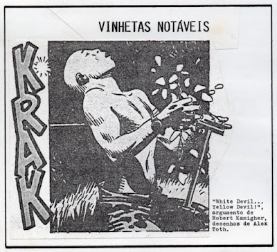
Robert Kanigher (w), Alex Toth (a), "White Devil ... Yellow Devil!," Star Spangled War Stories # 164, September 1972. As republished (in b&w) in Nemo # 5, November 1990 (scanned from the magazine mock-up).


This post could also be titled: White Flowers... Red Flowers.

I started writing about comics more than 25 years ago in the so-called fanzines Nuxcuro and Nemo (I don't like the term because I'm no fanatic, of course). That said, Manuel Caldas' amateur magazine Nemo was first published in 1986. I came on board in # 4 of the second series (August 1990). 

So, as you can see above, very early (in the next issue, really) Manuel Caldas accepted my suggestion to include a "Vinhetas Notáveis" [remarkable panels] section. What he doesn't know to this day, because I never told him, is that the above was not the remarkable panel that I intended. The real one is shown below:


"White Devil ... Yellow Devil!": I don't know who the colorist was? The Grand Comics Database doesn't help. Neither does Alex Toth.

This remarkable story was republished in Sgt. Rock Special # 8 (June 1990). This means that it was fresh on my mind and it impressed me enough to ask Manuel to open "our" brand new remarkable panels section with one of its panels. Below: Greg Theakston's colors for the same panel:


"White Devil ... Yellow Devil!" as republished in Sgt. Rock Special # 8, June 1990.  

The dirt was colored differently.
According to what I call my Nelson Goodman theory of comics fakes recoloring should be banned. Below we can see the first page of the story as originally published:


Robert Kanigher (w), Alex Toth (a), "White Devil ... Yellow Devil!," Star Spangled War Stories # 164, September 1972. The writer was the star of the show.

Anyway, let's see what Alex Toth said about it:


Caught here.

Now, Greg Theakston's colors (wrongly called Theakson):


Robert Kanigher (w), Alex Toth (a), Greg Theakston (c), "White Devil ... Yellow Devil!" as republished in Sgt. Rock Special # 8, June 1990.

There are few issues in the area of film preservation that arouse more anger than the issue of colorization. That is because it is an issue involving taste, and, to put it bluntly, anyone who can accept the idea of the colorization of black and white films has bad taste. 
I wholeheartedly agree, but I don't think that this is just a matter of taste. It's also a matter of a legitimate historical artifact vs. a fake. It's as if someone painted something over a Rembrandt or if someone rebuilt some part of St. Peter in Rome in some modern style. In the end, though, this is also a matter of taste because bad taste favors what's fake and flashy over what's authentic.

Why did (and does) the comics industry and comics readers accept  such a thing? Because, you see, not all comics creators were born equal. There's a hierarchy that mostly goes like this: 1) the drawer; 2) the writer; 3) the editor; 4) the inker; 5) the colorist; 6) the letterer. As you can see above the header of "White Devil ... Yellow Devil!" was erased from the republished version. This happened, methinks, because it gave the writer too much of a star status (which is too much for a # 2). This means that colors can be changed, but changing some master's drawings isn't easily accepted by readers (or should I say, watchers?).

But let's go back to the first page of "White Devil ... Yellow Devil!"... Among other minute differences Greg Theakston corrected the anonymous colorist's, according to Alex Toth, mistake: the white flowers at the end were colored red at the beginning. I would say that this (the correction, I mean) shouldn't have been done and yet... 

Greg Theakston's recoloring in this story is quite good and in many ways quite faithful to the original color. There are hundreds or thousands of horrible recoloring jobs out there (mainly using the worst nightmare of comics coloring: computer generated gradients that turn every surface into pristine plastic). So, I would say that this is a really bad choice to attack fake comics. And yet, I chose it for a purpose: since it is a borderline case between what should (only the original material should be reproduced) and shouldn't be done, I'm inclined to agree that correcting a blatant mistake is acceptable. On second thought the democracy of comics creators tells us that the original colorist has as much right to the integrity of his or her work as everybody else (the colorist was usually a woman, which is an additional reason, in the boys club that is the comics industry, to disrespect colors). I'm not even sure if we can call the red flowers a mistake. Alex Toth didn't own the story. He certainly didn't own the colors, so, if the colorist chose to color the flowers red on page one who is he to say that it was a mistake? If Sheldon Mayer, the editor, said nothing, the colors on the first page were always meant to be red, the color of blood, period. (Kindness is what kills both "devils" and we can metonymically link kindness to flowers.)

In the end the question is: who created this comic? Is Greg Theakston one of the creators? The answer is obviously and rotundly, no, he isn't.

Monday, July 25, 2016

José Muñoz Sobre Carlos Nine!


José Muñoz, Carlos Loiseau (Caloi), Carlos Nine, Caloi en su tinta, años noventa.

Sì, atorrante, hijo de zapateros, como yo, mas atorrante y jodòn que yo, este peronista nacional, querendòn y peliador se cultivò en los barrios de Haedo y cercanìas, quizàs hasta Moròn habrà llegado en sus andanzas. Hablando de tamangos (zapatos), los suyos tenìan una zapaterìa en Haedo, los mìos en La Paternal y Pilar. Su viejo ademàs tocaba en una orquesta de tangos amateur que amenizaba veladas en el gran Buenos Aires y tambièn en la Capital, durante los '40 y los '50. Lo conocì el mismo dìa en que me conociò, fué allà por el '84, cuando pude volver a Buenos Aires después de 12 anios de ausercia, 12! Nuestra primera conversaciòn fuè sobre empeines, dibujo, hormas, tìas bailarinas, tango, patios, conciencia nacional y popular, Pratt y Breccia, y de aquì pasamos a comentar las medias con ligas que gastaban los tangueros, y no solo ellos, de la època. El seguìa impresionado por la palidez de la piel de las piernas de su padre y de sus colegas que, agitàndose en un enviòn rìtmico, dejaban entrever al levantàrseles los pantalones, y de las estrìas oscuras, las inverosìmiles ligas de sostén que cruzaban esas blancuras nocturnas al neòn, agravadas por los lamentables colorcitos claros de las medias. Ahì me dije, yo a éste no me lo pierdo. Y asì nos seguimos frecuentando durante las 4 o 5 ultimas Argentinas, comentàndolas a todas, sumidos en desesperadas chanzas nacionales y cosmopolitas aderezadas de afectos caneros semiofendidos.
Carlitos Nine, gran talento de mis pagos.
Ah, Isabelinho, ni yo ni el, creo, estamos de acuerdo en que cambies el nombre de tu sitio, quizàs si el cambio lo propusieras para la entera especie humana, tipo "La especie que merece...!" habrìa un poco mas de quòrum.

José Muñoz Sobre Carlos Nine! - Coda

Bueno, bueno! Ni que decir tiene que es un gran honor recibirlo en este humilde Crib, maestro!
El suyo es un voto de calidad así que, Machete se queda.

Monday, July 18, 2016

The Last One With a PS - Coda

I'm seriously pondering the possibility of changing my blog's title to "This Art Form Deserves to Die!" What do you think?

Also, to know why, if you read French, read this.

The Last One With a PS

Below is the last elongated panel by Hugo Pratt on the cover of Misterix.


Héctor German Oesterheld (w), Hugo Pratt (a), Stefan Strocen (c), "La mina de los demonios" [the devils' mine], Misterix # 456, August 9, 1957.


By the way, I continue to read, on some French sites, that Hugo Pratt wrote this and that WITH Oesterheld. It's an improvement since the days when Oesterheld's name was completely forgotten, but get this people: Hugo Pratt didn't write a word in "Sgt. Kirk,""Ernie Pike" (except in one story, at the end of the run, that he did alone), or "Ticonderoga". Please, get your facts straight once and for all!... Enough already!...

À propos, je continue a lire, dans des sites français, que Hugo Pratt a écrit ceci et cela AVEC Oesterheld. Cést un progrès dès les jours où le nom d’Oesterheld était complètememt oublié, mais aprenez ceci s’il vous plaît: Hugo Pratt n’a pas écrit un mot de “Sgt. Kirk”, “Ernie Pike” (à l’exception d’une histoire qu’il a fait tout seul à la fin de la série), ou “Ticonderoga”. Verifiez les faits une fois pour toutes!... Ça suffit, non?..

Oh, and, another thing: the above image was never reprinted, as you see it above, since it was first published almost 60 years ago. This is indeed an amnesiac art form! On top of that the historiography of comics is full of false assumptions, like the one above, put into circulation by incompetent amateurish "historians" and adoring hagiographers. This art form deserves to die!...

Thursday, July 14, 2016

Geneviève - Coda

The guys down there at The Comics Journal did a great job to remember Geneviève:
starting with her own words and then going to a great obituary by Rob Clough to finish at a moving rememberance by Anders Nielsen.

You just look at that drawing below with a menacing cloud over her and the bright colors of her daughter's drawing mirroring her happy last moments with her. What really troubles me though is the empty word balloon. Maybe these are the words she will never be able to tell her as she grows up. It's sad beyond belief...

I hope that no one minds if I publish this great work of art here.


One last thing: I loved the words of Dylan Horrocks:
She introduce herself [at Angoulême] and gave me the most beutiful little book I'd seen in ages. [My wife] Terry and I hung out with her a bit that week and she treated us like co-conspirators, talking about the weirdness of Angoulême and her own feelings of disconfort. She was like a wild animal creeping around a zoo, looking in horror at the cages, afraid she might end up in one. Later, she sent me comics and records, and we saw her again when she came to New Zealand to play some gigs. I'm so glad we got to see her play. Her comics are among my favorite art of any kind, ever. Sometimes this world seems so cruel, and this is so awful and sad. But her art makes me fall in love with the world, with all its darkness and pain and beauty and love, and looking at it now is like a gift. She never went in the cage.

Sunday, July 10, 2016

Geneviève Castrée


I'm still in shock! Geneviève Elverum died three days ago! Her legacy in comics history is inversely proportional to the days she lived on earth!


Geneviève Castrée (Woelv), Gris, 2006.

Saturday, June 25, 2016

Bonecos


E, A Revista do Expresso, 18 de Junho de 2016.

Será possível um crítico ser tão cego que não vê o óbvio? A julgar pelos tristes textos de José Mário Silva na revista E do jornal Expresso, parece que sim (mas quem é o redactor-chefe borra-botas que deixa este senhor escrever sobre banda desenhada?). Leia-se o inenarrável texto e compare-se com a imagem: "os enquadramentos de Juan Cavia conseguem captar todas as subtilezas da expressão fisionómica dos soldados diante da brutalidade das situações de combate": só se for a subtileza de um martelo-pilão. Não penso ler a obra aqui em questão (Os Vampiros de Filipe Melo (a) e Juan Cavia (d), Tinta da China, 2016), mas não preciso de me sacrificar a esse ponto para ver as imagens que o jornal generosamente reproduz. A bonecagem que nos é mostrada é para ser levada a sério? Estamos perante um romance gráfico sobre a guerra colonial ou perante uma animação qualquer da Disney / Pixar? Sejamos sérios, por favor!...


Filipe Melo (a) e Juan Cavia (d), Os Vampiros, Tinta da China, 2016.

PS Depois de uma pesquisa na ficha técnica do Expresso está descoberto o borra-botas. Chama-se Jorge Araújo, para que conste. Ah e parece que agora falamos inglês: em vez de "redactor-chefe" (com ou sem desacordo ortográfico) dizemos "editor".

Friday, June 24, 2016

V de Vitória?

Como estou sem pachorra para estas coisas aqui fica o link para um post anónimo (helas!) com o qual concordo, embora com reservas.

Para que não restem dúvidas, aqui ficam as minhas discordâncias:

1) Não vejo a qualidade de V de Vingança em parte nenhuma. Para mim só é importante porque contém as ultimas páginas de Tony Weare (eu e David Lloyd somos ambos fãs incondicionais da série "Matt Marriott").

2) Se o número 1 me deixa dúvidas (mas, apesar de tudo, os nomes implicados merecem-me respeito), acho chocante que seja atribuído um mínimo de credibilidade a Fax de Sarajevo. Por favor! Joe Kubert transformou a guerra da Bósnia numa história do Sgt. Rock! E nem sequer se deu ao trabalho de investigar os uniformes. Se o problema era a guerra nos Balcãs, exigia-se Safe Area Gorazde de Joe Sacco, como é mais do que evidente.

De resto... nomes imprescindíveis? Os que o autor cita e Anke Feuchtenberger, Martin tom Dieck, Fabrice Neaud, Aristophane, Yoshiharu Tsuge, Chris Ware, Thierry van Hasselt, Olivier Deprez, Vincent Fortemps, Yvan Alagbé, Eric Lambé, Mat Brinkman, Federico del Barrio, Felipe H. Cava, e um longo etc...

Concordância absoluta: Debbie Drechsler!

Venn Diagram: Art/Comics


Venn Diagram: Art/Comics, The Society of Illustrators, New York, April 2, 2016.

A great panel hosted by Bill Kartalopoulos with Austin English, Aidan Koch, Blaise Larmée.

PS Brad: Sorry if I still didn't write about Toth and Kanigher! I've been busy writing a 6000 words piece for my good friend Manuel Caldas.

Wednesday, June 22, 2016

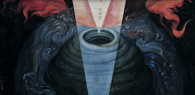
De Aetatibus Mundi Imagines - Fac-Simile


As I Wrote here and here Francisco de Holanda drew a 16th century graphic novel. Here's a great fac-simile.