Anyway, this post is about something a bit different. Below is a Sgt. Kirk page as it appears, tanning and all, in Misterix magazine + how I scan it... (as you know by now, I'm sure, the writer was Héctor Germán Oesterheld, the drawings are by Hugo Pratt, the colors are by Stefan Strocen).
Misterix # 317, October 15, 1954.
It seems that, presto!, all problems are solved with a click of the mouse, but alas, nope, look closer (literally).

Everything is stained and the lettering is a mess. I gave up restoring the letters after awhile because there are thousands of letters. It was an impossible task. As for the white space I can always clear things a bit, but, then, some lines disappear. Below is a panel as it was published in Misterix (left) and the same panel as published in Sgt. Kirk (right).

Misterix # 311, September 3, 1954.
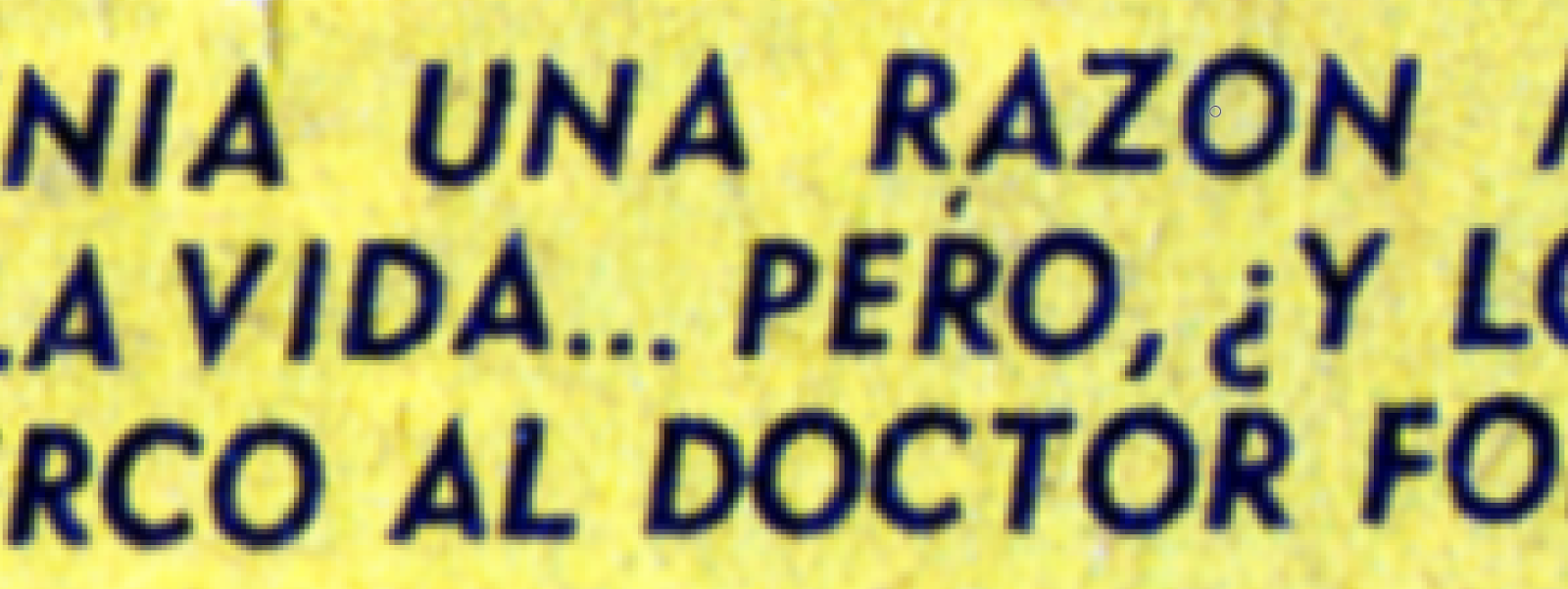
Sgt. Kirk # 25, July 1969.
The lines that aren't there are not the only problem. Look at how sttagering the difference in line quality is between these two images. Again: Misterix on the left. The panels are uncleaned this time.

Misterix # 317, October 15, 1954.
Sgt Kirk # 26, August 1969.
The line quality may be mediocre, but if you can read Spanish, you'll notice how elegant the caption is. Compare it to the ugly utilitarian and redundant caption in Italian. Isn't it a crime against the Castillian language that one of its best writers was ignored being Sgt. Kirk translated (!) in Spain from the Italian? Imagine people in the UK having access to Shakespeare's plays only through, say, translations from French translations! Only in the comics milieu, with our pitiful comics publishers, is such a thing possible.
Printing quality in the color pages is better, but are those clean? Judge for yourselves below...
Detail from Misterix # 322, November 19, 1954.
5 comments:
In conclusion, printing in Argentina was a mess. That's why all the Argentinean comic book reprints in Argentina suck! Using these old comics as source, you'll only get crap. I'm still bewildered that your restoration looks so good knowing how bad the source is.
And yep, we have to read Spanish reprints of Argentinean comics translated from the Italian. Even for El Eternauta in Spain they retranslated Oesterheld's text, because certain words or phrasing aren't applied the same in Spain (the use of “vos“ as a pronoun isn't used anymore in Spain, so has to be retranslated either into “usted" or “tu“, eventhough those two words are also used in Argentina and by Oesterheld). It's like the Americans having to dub films spoken with a Canadian, Australian or British accent.
And believe it or not, many classic books were translated into other languages using a previous translation from another language. Case in point: the Bible was translated from the Greek, which was a translation from another language, or the Thousand and One nights, for years the French translation was used for the other translations, and so on with many other books from foreign countries. So a translation from a book is used to translate the same book into another language. Yikes! No wonder some books don't make any sense.
Yes, but, what makes even less sense is the translation into the original language. In my opinion the lettering is autographic which means that it should be respected (translations excepted, obviously). Computer generated lettering is nowadays as big a scourge as computer generated coloring (when it's not done by Chris Ware, that is). For instance, the lettering of the new Alack Sinner edition from Salamandra looks awful.
Lettering is like leaving a signature. When Moebius (Jean Giraud) was asked by Marvel to do Silver Surfer, he not only inked his own work, but lettered it as well. BTW, you can create fonts based on a person's lettering. Sure, it looks mechanical, but it corresponds to the actual lettering. The French did it for the book of Breccia's and HGO's Che Guevara, for which as you know, the originals were burnt or seized by the military. They simply used one of the copies Breccia had buried in his garden, and created a lettering that followed that of the original comic. They called it Breccia Font (even though I don't think Breccia did the actual lettering himself). However, it has never been re-used since then. It's a pity, because it really looked like the original hand-lettering…
Fantagraphics apparently also created a font based on the lettering of the original El Eternauta. And as you know, Manuel does that for the Spanish translations of Prince Valiant. The lettering used in your samples of Sgt. Kirk don't seem too difficult to re-create on a computer, as they seem mechanical and not hand-made.
Unfortunately, nobody else cares for that…
I'm in a hurry now, but later I hope to find the email in which José Muñoz told me the name of Frontera's letterer.
As promised, Andrés Martìn was Frontera's letterer.
Post a Comment