Thursday, October 9, 2008

Jacques Callot's Les Miseres et les malheurs de la guerre


The year: 1633. The Thirty Years War was raging on. Jacques Callot was the right man to report it.
One of the first reporter-artists (if not the first one) Jacques Callot did many engraving cycles. The first one was Thirty Views of Rome, done a couple of years after he arrived in said city. Many more reportages would follow (Caprices of Various Figures, 1617, The Gypsies, 1621, Gobbi [Hunchbacks: these were Callot's shot at caricature drawing], 1622, The Siege of Breda, 1628). The latter is an impressive cycle of six huge prints recounting the events in a double-tiered strip. Other sieges would follow (Isle of Ré and La Rochelle, 1629 - 31).

Here's a site dedicated to Jacques Callot:


Baroque art was protean enough to favor sequentiality. If we add Caravaggio's Realism to the mix we get Jacques Callot's great Les Miseres et les malheurs de la guerre. Callot's drawings were incredibly complex, his lines were supple. His biggest prints, like The Fair at Imprunetta (1622) deny Scott McCloud's assertion that "there's no such thing as a sequence of one!" (Understanding Comics, 20). If the viewer gets lost in all the little, and yet, perfectly clear details, time and space are abolished as separate entities.
Callot's version of war in Les Miseres is not the usual glorification of the winners (in that case it would have been a mediocre piece of propaganda). The exception is the last scene, in which king Louis is incensed. Known once as La vita del soldato Callot narrates the enlistment of the troops and the battle but also what happened afterwards, when mercenaries plundered the war-ravaged region. Civilians were murdereded and raped, but Callot also shows us how they get their revenge killing the brutal soldiers. Punishment abounds: by hanging (Callot's most famous image is "The Hangman's Tree"), by firing-squad, by fire, with a wheel. After the war is over, maimed beggars seek help in front of an hospital. Some "children of the god Mars" even die in the streets. In the end, the true villain is war. Or, what's the same thing, the hubris and greed of a few...

You may see the Miseres, here (repros are far from great though):


Image:
from the Various Figures series (c. 1617): Callot shows an Italian peddler selling his prints.

Tuesday, October 7, 2008

Ana Hatherly's O Escritor - Coda

1.

2.

3.

4.

Images:
1. in the inside / outside game language is here outside the writer: as Roland Barthes put it in The Death of the Author: "For him [Stéphane Mallarmé], for us too, it is language which speaks, not the author;"
2. society creates meaning: "the prepotency of knowledge, knowledge that's multiple blindness;" (Ana Hatherly);
3. the writer's loneliness (original art): "(the writer who cries tears of ink)" (Ana Hatherly);
4. graffiti inspired painting, 2001: "My work begins with writing - I am a writer who drifts into the visual arts through experimenting with the word... My work also begins with painting - I am a painter who drifts towards literature through an awareness of the ties that unite all the arts, particularly in our society." (Ana Hatherly; translation Mick Greer; other Ana Hatherly quotes, my translation.)

Ana Hatherly's O Escritor


Here's how Ana Hatherly presented O Escritor [The Writer], a difficult visual text, to it's readers (my translation):

"O Escritor is a narrative in 27 phases. Each image is a pictogram, a photogram frozen on the page whose meaning is set in movement by reading. Reading is always multiple because, to the illusion of seeing, we add the illusion of reading. All pictograms are also cryptograms.
The history of imagination is also the history of imagination's vocabulary which implies what Coleridge called "the voluntary suspension of disbelief."
Between the author and the reader an accompliceship is created: possessed by a common code they decode each other.
That's how they institutionalize themselves.
The author and the reader are systematic explorers - the author presents the paths' map and the reader walks along them, but his wandering is freely conditioned.
The author creates the path of the experiment and walks ahead first, but when he publishes it, he betrays it, he changes it, that's how the experiment surpasses him.
It's at that instant that it acquires the value of a document because, referring to him, it also refers to itself: the publication is the summation of a series of acts, which, in themselves, also refer to a multitude of coexistences. If, to the author, the publication is the final phase, to the work it's the first one. So, the publication of his experience is as documental as the interpretation that the readers will perform.
O Escritor simultaneously documents a path and its petrification in the text, the way in which text gains autonomy, the way in which the former disappears into the latter: the way in which the writer substitutes talking for writing, his higher, more ambiguous, voice.
That's how different degrees of text legibility turn into a challenge to the construction of meaning.
The reader becomes a witness who testifies, acting in that historical process.
O Escritor, done between 1967 and 1972, may be particularly idiosyncratic of a difficult phase in which some Portuguese writers of the authoress' generation suffered discouragement and disbelief. Revolt and repulsion compelled them to continue, but, at the same time, mined their work. In that regard, it's also a necessary representation of a prolonged state of repression.

A. H., January, 1975."

The "prolonged state of repression" Ana Hatherly talks about is the Fascist régime that existed in Portugal from 1926 to 1974. It's interesting how this text is already influenced by post-structuralism: author and reader are possessed by the code instead of possessing it. On the other hand there's also present a major 20th century theme that Derrida inherited from modernism: the impossibility of communication.

Ana Hatherly wrote another text in which, contradicting a bit the above statement, she explains the book (adding that hers is just one of many possible readings). It would be fastidious to transcribe it here though. Let's just say that her themes are: the text and the writer; the fight between the writer and institutionalized culture (repression, as she put it above).

The last text in O Escritor (my translation):

"words fall on the writer's face like curtains of water that close over the horrified face of the poet the poet is inside in the inside or else he's outside the symbol falls over the uncovered face the face of discovery I sit down in my little glass box that is the page that isolates me and exposes me the words of the poet appear go up go down above all they are born exasperating the slowness of my hand writing all this unreadable because I write the act of writing the experience of expressing it without expressing I mean trying a thousand writings descend from where they descend they spring from unreadability laws on one side laws on another side everywhere there are laws to transgress."

Image:
O Escritor's last page: Caslon Neoclassical typography symbolizes the institutionalization of culture. This is highly appropriate because Neoclassicism is one the state's preferred architectural styles. In the end Ana Hatherly fights a conundrum (a lost fight): either she accepts the norm or she falls into incommunication. There's no meaning outside commonly accepted rules. There's no meaning outside the system.

Monday, October 6, 2008

Comics' Expanded Field - Coda

1.

2.

3.

4.

5.

Images:
1. The Wings of Eros by Simmias of Rhodes (old Greek visual poem);
2. Confab and Kaboom, 2006 by Mark Staff Brandl (gallery comics);
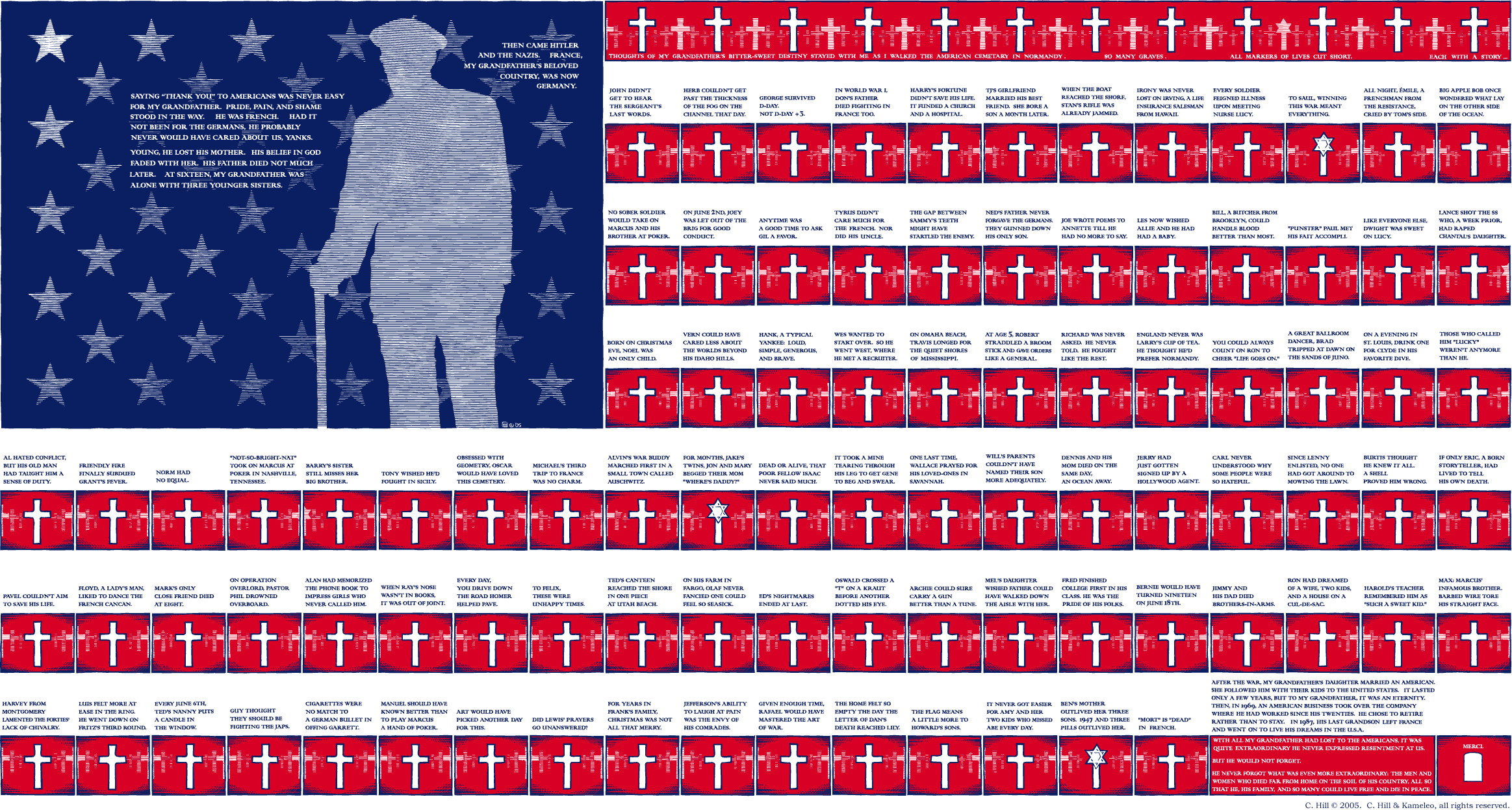
3. Christian Hill's impressive Stars, Crosses & Stripes, 2005 (more gallery comics);
4. Process-Poem by Álvaro de Sá, c. 1967;
5. The Fight, visual poem by Josep M. Figueres, 1976.

PS If, like me, you're loosing your eye sight, I recommend Stars, Crosses & Stripes, here:

Comics' Expanded Field


Rosalind Krauss wrote an important essay about how perplexing the concept of sculpture had become at the end of the seventies: Sculpture in the Expanded Field (1979):

http://tinyurl.com/44vbscx

The expanded field of comics may spread in time and social context (Medieval comics, for instance), but also in space (and social context): onto the gallery walls. Again, this process goes against a fixed concept of comics as low mass printed art.

Original comic art has been exposed in galleries, museums, and comics conventions (a strong tradition in Europe's comics conventions gives original art an important role as an attraction factor), but I don't mean that. What I mean is comic art meant to be exposed as unique objects on gallery walls. Most people would call these objects paintings inspired by comics. Don't take my word for it though, the artists themselves call "gallery comics" to what they're doing. Sorry to indulge in name-dropping, but I mean: Christian Hill, Mark Staff Brandl, Howie Shia. Andrei Molotiu could also be part of this list, I suppose; ditto Paper Rad: they all have strong links with the comics milieu. As for Brazilian painter Rivane Neuenschwander, American painter Laylah Ali and Swiss painter Niklaus Rüegg, I have no idea, but both Ali and Rüegg are interesting examples because, not only did they paint, their paintings were also original art (in the comics sense) for the publication of comic books (by the MOMA and Fink Editions, respectively).

At the risk of stating the obvious, words and drawings printed on paper may be what first comes to our minds when the word "comics" is mentioned. But the "language" of comics can also exist, in my humble opinion, in a painting on the wall (or on a computer screen, for that matter). I'm writing in English either if I write with a nib on parchment or paint words three stories high with a brush.

During the fifties Brazil was at the avant garde of poetry. Inspired by Stéphane Mallarmé's Coup de dés, Guillaume Apollinaire's calligrammes, Dadaism, Ezra Pound's Imagism, Haroldo and Augusto de Campos, Decio Pignatari, Pedro Xisto and others created Concrete poetry. In a Concrete poem typography and the pages' space is as important as words. Sounds are more important than meaning (or new meanings are born when words are reorganized on the space of the page).

More info, here.

http://www.ubu.com/papers/solt/brazil.html

In 1967 the Process-Poem was a new development that approached poetry and comics even more. Álvaro de Sá abandoned words to do comics (comics critic Moacy Cirne was also part of the movement).

Cf. more detailed info, here:

http://www.concentric.net/~Lndb/padin/lcppro.htm

Apart from being, with the Brazilians, one of the creators of Concrete poetry, Swiss Eugen Gomringer advocated an international visual poetry by the end of the sixties. A poetry that used photos, words, and easily recognizable graphic symbols. It also had, sometimes, a clear political message.
This is, in broad strokes, the international context in which Ana Hatherly's O Escritor (the writer) was written, drawn (1967 - 1972) and published (1975).

Image:
Zé Carioca no. 4, A Volta de Zé Carioca (1960). Edição Histórica, Ed. Abril by Rivane Neuenschwander, 2004. Rivane erased all characters and backgrounds from a Brazilian Disney comic.

Sunday, October 5, 2008

The Origin's Myth


Many thanks to all of you who publicized The Crib (Heidi MacDonald, Tom Spurgeon, Dirk Deppey, Pedro Moura, Jaime Lebre, Eddie Campbell, who quoted me on his fine blog). I also want to specially thank Nick Mullins and Bill Randall who posted on their blogs about me. It's because Bill said that Ana Hatherly is his favorite inclusion in my canon that I'll write about her in my next posts. But first, a few words about the reasons why I included Ana's O Escritor:
There are, at least, four cultural fields that can help to expand comics as an art form: Medieval (or older art) painting and book illustration; the wordless engraving cycle; Modern and Post-Modern painting; Concrete and Visual Poetry. None of these fields are linked to comics on the gentiles' heads. For a variety of reasons they all have problems to be accepted by the comics milieu as well. Let's briefly examine some of these objections:
1. Medieval comics (let's call them that way) weren't produced for the enjoyment of the people: they weren't reproduced, they were highly expensive items, they were owned by aristocrats. Since the beginning of fandom that comics are viewed as popular art: a child of the Industrial Revolution and modern visual mass communications (hence: comics were born in America with the publication of The Yellow Kid in the New York Journal: "The Yellow Kid and His New Phonograph," October 25, 1896; this is a position that American scholar Bill Blackbeard defends to this day). Besides this sociological criterion we must add two formal ones in this particular case: the existence of juxtaposed panels and the existence of speech balloons. Denying the latter some European scholars (Thierry Gröensteen and Benoît Peeters, for instance) argued that comics started with Rodolphe Töpffer's first "Histoires en estampes" (Histoire de M. Vieux Bois was drawn in 1827 - Histoire de M. Jabot was published in 1833; Töpfferians who are also print fundamentalists must say that Jabot was the first comic, other Töpfferians will say that Vieux Bois is the real McCoy). In his book The Early Comic Strip historian David Kunzle argued that the first comics were created shortly after the invention of the mechanical printing press by Johann Gutenberg (Hans Holbein's Les Simulacres et historiées faces de la mort is among the first books that he cites, but his most famous example is Francis Barlow's A True Narrative of the Horrid Hellish Popish Plot, c. 1682). David Kunzle later converted to Töpfferism (He recently published a book titled Father of the Comic Strip: Rodolphe Töpffer, University Press of Mississippi, 2007). Barlow's two pages fulfill Bill Blackbeard's criteria, by the way: they were printed, they have a grid, they even have speech balloons or something similar (Robert S. Petersen called them "emanata scrolls").
2. Engraving cycles, from Jacques Callot to Eric Drooker, aren't as difficult to accept (in the comics corpus) by the comics milieu as Medieval illustrations. This happens because they were born from an idea that art should be more democratic: engravings are cheaper than paintings and sculptures. Even so the high / low divide may be a serious objection here. Even if Frans Masereel had a leftist sensibility and his cycles were (are) published in book form, he was a serious painter, he was in the wrong side of this sociological fence. If I defend Picasso as a comics artist the comics milieu calls me a snob and an elitist (doing their usual mind reading they say that I want to include highly regarded gallery artists in the comics canon just to elevate comics' status). Formal features are a problem also: engraving cycles have no speech balloons or page grids.
3. To the comics milieu paintings and poems (visual or otherwise) are not comics, period.
If we consider stained glass windows as comics (something that is not as far-fetched as it seems) Medieval comics were also meant to be viewed by "the masses" even if they weren't printed (David Kunzle opines differently though: "A mass medium is mobile; it travels to man, and does not require man to travel to it.") As for grids and speech balloons it's possible to find said features in Medieval comics, believe it or not. Here's what Thierry Gröensteen wrote on the Platinum List (Jan 18, 2000): "Danielle Alexandre-Bidon, a specialist of the Middle-Age, has given a lot of evidence of the fact that comics existed in the medieval manuscripts, during the 11th, 12th and 13th centuries. Hundreds, if not thousands of pages, with speed lines, word balloons, sound effects, etc. The language of comics had already been invented, but these books were not printed. After Gutenberg, text and image were not so intimately linked anymore, and one could say that the secret of comics was lost, until Töpffer rediscovered it." This is revealing: even the most fervent defender of Töpffer as the "father of the comic strip" says here that he "rediscovered it." This is something like saying that Columbus rediscovered America (he couldn't discover it simply because he found people already living in there when he arrived).
Talking of which, here's one of my few posts to the Platinum Age List (with minor changes; September 3, 2007):
"To discuss is OK, but, in my opinion, it's impossible to reach any conclusions. This happens because the origin's myth is essentialist: it's an arbitrary choice that's based on an equally arbitrary definition (the latter precedes the former). (And I'm sure that I'm not the first one to say this, elsewhere or around here.) The two more common (or so it seems to me) kinds of definitions are based on social (comics must be reproduced and distributed to the masses) and formal premises (essential characteristics of comics are sequentiality, word and image relations, the word balloons, the juxtaposition of the panels, etc...). Social definitions of comics have two problems:1) The sorites paradox applied to the concept of "masses." If one grain of wheat doesn't make a heap two grains of wheat do not; [...] if three thousand grains of wheat don't make a heap three thousand and one grains of wheat do not; etc... When do we stop not having a heap to finally have one? This paradox can be applied to print runs. 2) Social definitions of comics are usually used to deny that Medieval comics are comics (they aren't reproduced). What I say is that they must have been reproduced at some point because I've seen them and I have never seen any original drawings. There's a third point: how come an original comics page is not a comic, but an exact repro is? Mr. de Sa cleverly argued this point saying: the original art is not a comic the same way as the repro of a painting is not a painting. Not bad, I would say... Formal definitions of comics have problems also; I'll mention two: 1) Any formal definition arbitrarily chooses some features and forgets others. This means that, if I chose to say something like "the speech balloon is essential to comics" (oops, there goes Prince Valiant) or "word and image relations define comics" (oops there go "mute" comics out the window) no comics exist at all. Why? Because all comics have panels without speech balloons, without words, etc... A comics reading would be something like this: now it's a comic, oops, now it isn't, etc... 2) All art is based on experiment. More inventive artists are always pushing the limits of their art forms. Comics are no exception, but if we put a formal corset around them what happens is that: (1) we lose some very important artistic achievements (some who defend comics exactly because they're mass art couldn't care less, obviously, but I, for one, do) and (2) we seriously limit the creativity of the artists who chose to create comics. Another problem is that we can't look back to, let's say, Frans Masereel, and view his work as comics (again: some who defend comics...). It seems that all comics have sequenciality, but even this point was argued by Eddie Campbell in a discussion with yours truly many moons ago: he included one panel cartoons in the comics concept. Me?, I have no definition of comics whatsoever. I prefer to say with Saint Augustine: If no one asks me, I know what they are; If I wish to explain them to him who asks, I do not know.

Images:
Francis Barlow's A True Narrative of the Horrid Hellish Popish Plot, c. 1682.

PS One thing that baffles me all the time is that these aren't comics (remember, we are seeing webimages):

this, on the other hand, is (myths have their own logic, I suppose):
http://www.pressibus.org/bd/debuts/topffer/topffer09.html "

In my next post I'll address gallery comics and visual poetry.

Friday, October 3, 2008

John Porcellino's Sam - Coda

1.

2.

3.


4.

5.

Images:
the evolution of John Porcellino's Drawing Style:
phase one:
1. lively bad art (heta-uma, according to King Terry) inspired by punk rock (even so John Porcellino's keen eye is already evident);
2. all that and a premonitory dream;
phase two:
3. Porcellino's style is now very stylized: caricatural, clean, minimalist, well balanced, Zen, poetical (German book's cover: September 1998);
4. Silly - Cat was a dos-à-dos zine published December 1997 (the second "dos" was Joe Chiapetta who published Silly Daddy);
5. a great example of John's writing found in Silly - Cat (please add melancholy to the above list): John Porcellino perfectly does here what Tom Devlin (I suppose) said that he does best: "His spare approach to words and pictures focuses on the smallest of details, revealing a wealth of meaning and emotion in everyday events that most of us overlook in our daily hustle and bustle." (King-Cat classix's dustjacket's flap.)

PS John's site: http://www.king-cat.net/