"Cerco de Muerte" [the siege of death], Misterix # 317, October 15, 1954.
The above page is part of a Sgt. Kirk episode that came directly from Fort Apache (1948) the film by director John Ford written by James Warner Bellah (his original story is titled "Massacre") and Frank S. Nugent (screenplay). It's interesting (but not surprising) that two of my favorite comics artists (one's a writer, of course), Carl Barks and Héctor Oesterheld were both John Ford's fans.
The situation is as follows: lieutenant colonel Owen Thursday (Henry Fonda) underestimates the Apaches ("You make me suspect your Cochise has studied under Alexander the Great, or Bonaparte at least.") and enters a canyon where the Indians expect his column slaughtering everybody. In the comic a nameless lieutenant recklessly attacks the Indians (Sioux this time) to meet the same fate as the Fort Apache troopers. I posted a couple of Hugo Pratt's swipes sometime ago... this is an obvious Oesterheld swipe. As for Pratt's editing, it's interesting to compare it with Ford's and Murray's:
Corto and Dinard (Kirk is with them) witness the massacre from a safe distance, powerless to do anything...
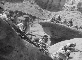
Ditto captain York (John Wayne) and lieutenant O'Rourke (John Agar)... Both images have a low angle shot.
In both sequences the soldier who plays the bugle is shot...
...but lacking movement the situation is a bit ambiguous in the comic (is he just riding his horse or is he starting to fall?).
In both sequences the Indians are shown ambushed:
from above (high angle shot)
and from below (low angle shot);
an impressive display (low angle shot);
the ambush viewed from above (high angle shot) combined with a pan shot of the cavalry men passing through the canyon.
The military column is isolated in the comic panel above. The comic's readers never see the Sioux and the soldiers in the same frame.
In conclusion: the comic is a lot more elliptical than the film (no surprise there) creating even some ambiguity. On the other hand the film editing (by Ford and Jack Murray) is very similar to Hugo Pratt's, but comics have page layouts and films don't, of course. This page layout is what Benoit Peeters called rhetorical: panel sizes adapt to what they're showing. The colors are by Stefan Strocen and are magnificent as usual in this Pop Art inspired artist. They create a warm, but crepuscular atmosphere. Finally, there's what Philippe Marion called graphiation. Hugo Pratt's "hand" is visible while film stills are the product of a machine.


No comments:
Post a Comment