Monday, October 6, 2008

Comics' Expanded Field - Coda

1.

2.

3.

4.

5.

Images:
1. The Wings of Eros by Simmias of Rhodes (old Greek visual poem);
2. Confab and Kaboom, 2006 by Mark Staff Brandl (gallery comics);
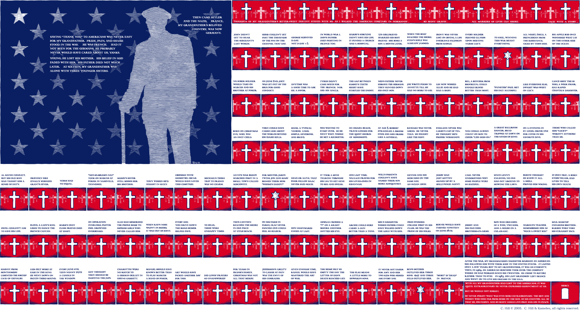
3. Christian Hill's impressive Stars, Crosses & Stripes, 2005 (more gallery comics);
4. Process-Poem by Álvaro de Sá, c. 1967;
5. The Fight, visual poem by Josep M. Figueres, 1976.

PS If, like me, you're loosing your eye sight, I recommend Stars, Crosses & Stripes, here:

Comics' Expanded Field


Rosalind Krauss wrote an important essay about how perplexing the concept of sculpture had become at the end of the seventies: Sculpture in the Expanded Field (1979):

http://tinyurl.com/44vbscx

The expanded field of comics may spread in time and social context (Medieval comics, for instance), but also in space (and social context): onto the gallery walls. Again, this process goes against a fixed concept of comics as low mass printed art.

Original comic art has been exposed in galleries, museums, and comics conventions (a strong tradition in Europe's comics conventions gives original art an important role as an attraction factor), but I don't mean that. What I mean is comic art meant to be exposed as unique objects on gallery walls. Most people would call these objects paintings inspired by comics. Don't take my word for it though, the artists themselves call "gallery comics" to what they're doing. Sorry to indulge in name-dropping, but I mean: Christian Hill, Mark Staff Brandl, Howie Shia. Andrei Molotiu could also be part of this list, I suppose; ditto Paper Rad: they all have strong links with the comics milieu. As for Brazilian painter Rivane Neuenschwander, American painter Laylah Ali and Swiss painter Niklaus Rüegg, I have no idea, but both Ali and Rüegg are interesting examples because, not only did they paint, their paintings were also original art (in the comics sense) for the publication of comic books (by the MOMA and Fink Editions, respectively).

At the risk of stating the obvious, words and drawings printed on paper may be what first comes to our minds when the word "comics" is mentioned. But the "language" of comics can also exist, in my humble opinion, in a painting on the wall (or on a computer screen, for that matter). I'm writing in English either if I write with a nib on parchment or paint words three stories high with a brush.

During the fifties Brazil was at the avant garde of poetry. Inspired by Stéphane Mallarmé's Coup de dés, Guillaume Apollinaire's calligrammes, Dadaism, Ezra Pound's Imagism, Haroldo and Augusto de Campos, Decio Pignatari, Pedro Xisto and others created Concrete poetry. In a Concrete poem typography and the pages' space is as important as words. Sounds are more important than meaning (or new meanings are born when words are reorganized on the space of the page).

More info, here.

http://www.ubu.com/papers/solt/brazil.html

In 1967 the Process-Poem was a new development that approached poetry and comics even more. Álvaro de Sá abandoned words to do comics (comics critic Moacy Cirne was also part of the movement).

Cf. more detailed info, here:

http://www.concentric.net/~Lndb/padin/lcppro.htm

Apart from being, with the Brazilians, one of the creators of Concrete poetry, Swiss Eugen Gomringer advocated an international visual poetry by the end of the sixties. A poetry that used photos, words, and easily recognizable graphic symbols. It also had, sometimes, a clear political message.
This is, in broad strokes, the international context in which Ana Hatherly's O Escritor (the writer) was written, drawn (1967 - 1972) and published (1975).

Image:
Zé Carioca no. 4, A Volta de Zé Carioca (1960). Edição Histórica, Ed. Abril by Rivane Neuenschwander, 2004. Rivane erased all characters and backgrounds from a Brazilian Disney comic.

Sunday, October 5, 2008

The Origin's Myth


Many thanks to all of you who publicized The Crib (Heidi MacDonald, Tom Spurgeon, Dirk Deppey, Pedro Moura, Jaime Lebre, Eddie Campbell, who quoted me on his fine blog). I also want to specially thank Nick Mullins and Bill Randall who posted on their blogs about me. It's because Bill said that Ana Hatherly is his favorite inclusion in my canon that I'll write about her in my next posts. But first, a few words about the reasons why I included Ana's O Escritor:
There are, at least, four cultural fields that can help to expand comics as an art form: Medieval (or older art) painting and book illustration; the wordless engraving cycle; Modern and Post-Modern painting; Concrete and Visual Poetry. None of these fields are linked to comics on the gentiles' heads. For a variety of reasons they all have problems to be accepted by the comics milieu as well. Let's briefly examine some of these objections:
1. Medieval comics (let's call them that way) weren't produced for the enjoyment of the people: they weren't reproduced, they were highly expensive items, they were owned by aristocrats. Since the beginning of fandom that comics are viewed as popular art: a child of the Industrial Revolution and modern visual mass communications (hence: comics were born in America with the publication of The Yellow Kid in the New York Journal: "The Yellow Kid and His New Phonograph," October 25, 1896; this is a position that American scholar Bill Blackbeard defends to this day). Besides this sociological criterion we must add two formal ones in this particular case: the existence of juxtaposed panels and the existence of speech balloons. Denying the latter some European scholars (Thierry Gröensteen and Benoît Peeters, for instance) argued that comics started with Rodolphe Töpffer's first "Histoires en estampes" (Histoire de M. Vieux Bois was drawn in 1827 - Histoire de M. Jabot was published in 1833; Töpfferians who are also print fundamentalists must say that Jabot was the first comic, other Töpfferians will say that Vieux Bois is the real McCoy). In his book The Early Comic Strip historian David Kunzle argued that the first comics were created shortly after the invention of the mechanical printing press by Johann Gutenberg (Hans Holbein's Les Simulacres et historiées faces de la mort is among the first books that he cites, but his most famous example is Francis Barlow's A True Narrative of the Horrid Hellish Popish Plot, c. 1682). David Kunzle later converted to Töpfferism (He recently published a book titled Father of the Comic Strip: Rodolphe Töpffer, University Press of Mississippi, 2007). Barlow's two pages fulfill Bill Blackbeard's criteria, by the way: they were printed, they have a grid, they even have speech balloons or something similar (Robert S. Petersen called them "emanata scrolls").
2. Engraving cycles, from Jacques Callot to Eric Drooker, aren't as difficult to accept (in the comics corpus) by the comics milieu as Medieval illustrations. This happens because they were born from an idea that art should be more democratic: engravings are cheaper than paintings and sculptures. Even so the high / low divide may be a serious objection here. Even if Frans Masereel had a leftist sensibility and his cycles were (are) published in book form, he was a serious painter, he was in the wrong side of this sociological fence. If I defend Picasso as a comics artist the comics milieu calls me a snob and an elitist (doing their usual mind reading they say that I want to include highly regarded gallery artists in the comics canon just to elevate comics' status). Formal features are a problem also: engraving cycles have no speech balloons or page grids.
3. To the comics milieu paintings and poems (visual or otherwise) are not comics, period.
If we consider stained glass windows as comics (something that is not as far-fetched as it seems) Medieval comics were also meant to be viewed by "the masses" even if they weren't printed (David Kunzle opines differently though: "A mass medium is mobile; it travels to man, and does not require man to travel to it.") As for grids and speech balloons it's possible to find said features in Medieval comics, believe it or not. Here's what Thierry Gröensteen wrote on the Platinum List (Jan 18, 2000): "Danielle Alexandre-Bidon, a specialist of the Middle-Age, has given a lot of evidence of the fact that comics existed in the medieval manuscripts, during the 11th, 12th and 13th centuries. Hundreds, if not thousands of pages, with speed lines, word balloons, sound effects, etc. The language of comics had already been invented, but these books were not printed. After Gutenberg, text and image were not so intimately linked anymore, and one could say that the secret of comics was lost, until Töpffer rediscovered it." This is revealing: even the most fervent defender of Töpffer as the "father of the comic strip" says here that he "rediscovered it." This is something like saying that Columbus rediscovered America (he couldn't discover it simply because he found people already living in there when he arrived).
Talking of which, here's one of my few posts to the Platinum Age List (with minor changes; September 3, 2007):
"To discuss is OK, but, in my opinion, it's impossible to reach any conclusions. This happens because the origin's myth is essentialist: it's an arbitrary choice that's based on an equally arbitrary definition (the latter precedes the former). (And I'm sure that I'm not the first one to say this, elsewhere or around here.) The two more common (or so it seems to me) kinds of definitions are based on social (comics must be reproduced and distributed to the masses) and formal premises (essential characteristics of comics are sequentiality, word and image relations, the word balloons, the juxtaposition of the panels, etc...). Social definitions of comics have two problems:1) The sorites paradox applied to the concept of "masses." If one grain of wheat doesn't make a heap two grains of wheat do not; [...] if three thousand grains of wheat don't make a heap three thousand and one grains of wheat do not; etc... When do we stop not having a heap to finally have one? This paradox can be applied to print runs. 2) Social definitions of comics are usually used to deny that Medieval comics are comics (they aren't reproduced). What I say is that they must have been reproduced at some point because I've seen them and I have never seen any original drawings. There's a third point: how come an original comics page is not a comic, but an exact repro is? Mr. de Sa cleverly argued this point saying: the original art is not a comic the same way as the repro of a painting is not a painting. Not bad, I would say... Formal definitions of comics have problems also; I'll mention two: 1) Any formal definition arbitrarily chooses some features and forgets others. This means that, if I chose to say something like "the speech balloon is essential to comics" (oops, there goes Prince Valiant) or "word and image relations define comics" (oops there go "mute" comics out the window) no comics exist at all. Why? Because all comics have panels without speech balloons, without words, etc... A comics reading would be something like this: now it's a comic, oops, now it isn't, etc... 2) All art is based on experiment. More inventive artists are always pushing the limits of their art forms. Comics are no exception, but if we put a formal corset around them what happens is that: (1) we lose some very important artistic achievements (some who defend comics exactly because they're mass art couldn't care less, obviously, but I, for one, do) and (2) we seriously limit the creativity of the artists who chose to create comics. Another problem is that we can't look back to, let's say, Frans Masereel, and view his work as comics (again: some who defend comics...). It seems that all comics have sequenciality, but even this point was argued by Eddie Campbell in a discussion with yours truly many moons ago: he included one panel cartoons in the comics concept. Me?, I have no definition of comics whatsoever. I prefer to say with Saint Augustine: If no one asks me, I know what they are; If I wish to explain them to him who asks, I do not know.

Images:
Francis Barlow's A True Narrative of the Horrid Hellish Popish Plot, c. 1682.

PS One thing that baffles me all the time is that these aren't comics (remember, we are seeing webimages):

this, on the other hand, is (myths have their own logic, I suppose):
http://www.pressibus.org/bd/debuts/topffer/topffer09.html "

In my next post I'll address gallery comics and visual poetry.

Friday, October 3, 2008

John Porcellino's Sam - Coda

1.

2.

3.


4.

5.

Images:
the evolution of John Porcellino's Drawing Style:
phase one:
1. lively bad art (heta-uma, according to King Terry) inspired by punk rock (even so John Porcellino's keen eye is already evident);
2. all that and a premonitory dream;
phase two:
3. Porcellino's style is now very stylized: caricatural, clean, minimalist, well balanced, Zen, poetical (German book's cover: September 1998);
4. Silly - Cat was a dos-à-dos zine published December 1997 (the second "dos" was Joe Chiapetta who published Silly Daddy);
5. a great example of John's writing found in Silly - Cat (please add melancholy to the above list): John Porcellino perfectly does here what Tom Devlin (I suppose) said that he does best: "His spare approach to words and pictures focuses on the smallest of details, revealing a wealth of meaning and emotion in everyday events that most of us overlook in our daily hustle and bustle." (King-Cat classix's dustjacket's flap.)

PS John's site: http://www.king-cat.net/

John Porcellino's Sam


It was June 23, 1998. I was (and still am, even if it is completely dead now) subscribed to Usenet's comix@ mailing list. I fondly remember it even if, as usual, my www persona quarreled a lot in there. One of said list's regular features was Read This Comic under which members reviewed what they considered to be, well... comics worth reading...

John Porcellino is an important small-press creator who self-publishes King-Cat Comics and Stories - John told me just yesterday that issue # 69 will be available soon: check it out! His great graphic novel Perfect Example was published by now defunct Highwater Books (2000); La Mano published Diary of a Mosquito Abatement Man in 2005; a huge King-Cat retrospective was published in 2007 by Drawn & Quarterly.

If you remember James Kochalka's diatribes against craft you'll understand John Porcellino's DIY punk aesthetics (late eighties, early nineties). As time passed his drawing style evolved into a highly stylized, very simple, Zen-like minimalism.

As for Read This Comic, here's my contribution with minor changes (it was June 23, more than ten years ago; the last phrase is my touchstone to recognize greatness):

Sam is a story self-published by John Porcellino in the mini-comic King-Cat Comics & Stories No. 38, dated March 1993. Sam is short for Porcellino's she dog's name, Samantha Love. This story is about what she meant to him through her own life, his childhood, adolescence, young adult's years.
Porcellino's drawing style is what we could call minimalist: the characters are just diagrams and there's almost no backgrounds; shading doesn't exist and the lines have always the same thickness and shaky quality; there's almost no perspective (when it exists it's used with deliberate "mistakes"). King-Cat's outdoor scenes usually show a great composition sense conveying a slow pace for the little characters who wander through the sketchy, but well balanced landscape. These melancholic panels don't appear in Sam though... This is an indoor and intimate story (one panel in page four is the exception). Porcellino's drawings have a roundness that conveys warmness. (Conversely, the troubled adolescent in page five has a saw-like hairdo: a symbol of rebellion as we can see in the character Calvin of Calvin & Hobbes' fame, or Bart Simpson of The Simpsons' fame.)
The characters are shown mostly as talking heads. The most elaborate compositions in the story are those in which Sam appears (Sam's the star of the show, after all). Porcellino uses an eight panel grid, the same one once used by Dell in their children's comics. This transports Western readers directly to the past, but, at the same time, gives us a regular pace (most panels have an equal, if shaky, shape) which, like the regular beat of a clock, goes on and on unto the inevitable conclusion of us all, living beings: death.
John Porcellino's writing is as simple and straightforward as his drawing style. The lettering combines capital letters and small letters in a bad-good way that, again, is in accordance with the drawings being also typical of punk aesthetics.
All through Sam we can see how John's love for his pet grows. During his difficult adolescent years Sam was always there for him. In the end we can understand his sorrow when she dies. A particularly deep panel is the one in which his friend of many years turns her back on him: Sam's there but, at the same time, she's not there anymore. Soon she will die of old age and old animals (the same way as old people) bid their farewells to this world way before their loved ones bid farewell to them.
One of Porcellino's poetical one pagers, 13 Stars, is an epilogue to Sam. In it she appears as a ghost: the ghost of memory, the ghost of lost love and all lost things. So are all true works of art: ghosts that haunt us in a disturbing way. I, for one, found that reading this story was a truly haunting and marvelous experience. Sam is so simple and sad, and, yet, so beautiful...

Image:
A 13 Stars version that I commissioned to John.

Wednesday, October 1, 2008

Chago Armada's Sa-Lo-Mon - Coda

1.

2.

3.

4.

5.

Images (1., 2., 3., 4., from El humor otro, 1963):
(1. "at noon the shadow hides under the man";
2., 3.): very simple figures convey a Leopardi type of humor;
4. Sa-Lo-Mon builds his own prison to escape afterwards using his imagination (more complex ideas were deemed too obscure to Fidel);
5. Chago Armada's painting Lo amorfo y descorazonador del diálogo vacío (the amorphous and disheartening of vacuous dialog), 1968: some of Chago's abstract paintings and drawings are clearly influenced by his comics, but not in a Neo-Dada, detached, ironical, "I'm an alchemist transforming lead into gold", kind of way. There is a very direct, very creative vein between the two (in these multi-tiered paintings with speech balloons I wonder if there's any difference). Until proven wrong I suppose that Chago Armada created abstract comics.

PS On second thought, maybe Lettriste extraordinaire Isidore Isou is also a contender.

Chago Armada's Sa-Lo-Mon


Considering that I have fluid criteria to "define" comics (I don't do that, really), it's obvious that I should have included Saul Steinberg in my first post (the mother of all that's following, to quote, you know who). There's sequenciality in some of his cartoons, if sequenciality is important to define the art form... Anyway, if Steinberg wasn't there, a great follower was: Chago Armada.

Santiago "Chago" Armada was born in Palma Soriano, Cuba, and was one of Fidel Castro's "guerrilleros" in the Sierra Maestra. It was there that he drew his first character: Julito 26, for El cubano libre. In 1961 he created "Sa-Lo-Mon" for Revolución newspaper. In 1963 he published his book El humor otro (another kind of humor) in which a few of his "Sa-Lo-Mon" strips and pages were republished. Considered too hermetical and, consequentially, too bourgeois, "Sa-Lo-Mon" was discontinued in 1963. The same thing happened to Rafael Fornés' "Don Sabino." Oy!...
There are two different phases in the "Sa-Lo-Mon" series: the poetical comic strip and the philosophical page. "Sa-Lo-Mon is a very simple caricature at first (he's the innocent naked human) to become a more sophisticated fool with a mask. The three syllables dividing the name Salomon are a conceptual, visual, phonetical mirror to the language of comics. With this series Chago Armada explored all things human: innocence, curiosity, scatology, wonderment, boredom, sexuality, etc... After finishing its life in comics, Sa-Lo-Mon fuelled Chago Armada's paintings (he really did abstract comics as early as the sixties). It's maddening that tons of ink and paper are wasted every day in order to publish mediocrities while this masterpiece remains completely unknown. Ry Cooder and Wim Wenders, where are you when you're needed?...

Image
: an anti children's comics cartoon by another Cuban Steinberg influenced cartoonist: René de la Nuez (El caballo de Troya, 1984).

PS: A gallery of Cuban art showing some of Chago's paintings:
http://www.galeriacubarte.cult.cu/g_artista.php?item=190&lang=eng